Exhibition Design No. 9, Fabric Object

Princeton, New Jersey, 2024

Fabric Object is a small show on the early career of Diana Agrest and Mario Gandelsonas, of Agrest and Gandelsonas Architects. There are seven projects, mostly unbuilt, all related to ideas of urbanism, presented through things made by hand. Drawings. Writings. What seemed important was to show an intimacy to their work, while also showing how impersonal it is. It may sound contradictory, but Agrest and Gandelsonas have always played with oppositional binaries. Individual-Collective. Building-City. Memory-Amnesia. Fabric-Object. Like the flip-flop reversibility of their axonometric drawings (think El Lissitsky Proun,) architecture appears as something and an inversion of that thing. They love design. They love non-design. Architecture is autonomous. Architecture relies upon the city. And so on. Maybe this is because there are two of them. With two, and is inevitable. Or perhaps their work is simply a product of its time, a collection of 1968 Pre-Post-Structuralist desires (think Barthes, Saussure, Kristeva, Lacan, etc..) brought into Architecture, ideas like Language as a Model (and Speech as a Model and Text as a Model,) Dialectical Opposition, Semiotics, Typology, Rejection of Authorship/Individualism, and so on. If you read their descriptions of their own work, they will tell you what everything means. This as That. That as This. They construct complex thoughts and arguments with their work, but they will also tell you that it can never mean any one thing, there is always and.

With and in mind, the exhibition includes multiple perspectives and thoughts on their work by Princeton School of Architecture faculty.

Project Team: Michael Meredith, Hilary Sample, Andy Kim

North Gallery, Princeton University School of Architecture, Princeton, New Jersey, March 7–May 3, 2024

  1. 1
  1. 2
  2. 3
  3. 4
  4. 5
  5. 6
  6. 7
  7. 8
  8. 9
  9. 10
  10. 11
  11. 12
  12. 13
  13. 14
  14. 15
  1. 16
  2. 17
  3. 18
  4. 19
  5. 20
  6. 21
  7. 22
  8. 23
  9. 24
  10. 25

Software No. 16, DROP

P5, 2023

Playing with video game physics again, mass, gravity, friction, and so on.  Real. Not Real. Color. Virtual velcro. Stuff we did at the beginning of the office. A subjectivity. A style. Our reaction against idealized form, geometry, the maniacal control of the Parametric. Letting things happen. Chance. A different complexity. Learning not to be so neurotic. Unlearning what we were taught. Architects only see the mistakes. We look for perfection. We see problems everywhere. Misalignments. It’s an occupational pathology. We always think we can make it better. This is looking for something else, casual, informal, joy, not sure.  We’re still trying to be okay with joy. It doesn’t come easily nowadays. An exercise to see differently. Totemic figures, stacks, shapes, sticky amalgamated objects. A kind of beauty.

Project Team: Michael Meredith, Hilary Sample, Ben Dooley

  1. 1
  2. 2
  3. 3
  1. 4
  2. 5

Housing No. 17, Missing Middle

Chicago, Illinois, 2023

1 lot. 2 row houses. Adaptable to multiple lots. A lot. A larger lot. Another lot. Modular Construction. Ceramic panels on a lightweight structural frame. Everything arrives on trucks. Stacked. The roof collects rainwater and solar. Terraces, front and back. Ventilation. Light. The ground floor can provide additional revenue, a small store, an architecture office, a studio, a coffee shop, or another apartment. The second floor is the apartment, living, kitchen, bathroom, a small office. The third and fourth floors have bedrooms, shared spaces, a media room, a ping pong table or a library, or karaoke, or an indoor garden. They can have 2 bedrooms. or 6. 2 in 1 addresses housing through incremental development, variable mixed use, middle scale, low-rise high density that is economical and flexible.

Project Team: Michael Meredith, Hilary Sample, Joel McCullough, James Wood

  1. 1
  2. 2
  3. 3
  4. 4
  5. 5
  6. 6
  7. 7
  8. 8
  9. 9
  10. 10
  11. 11
  12. 12
  1. 13
  2. 14
  3. 15
  4. 16
  5. 17
  6. 18
  1. 19
  2. 20
  3. 21
  4. 22
  5. 23

Rug No. 1–5, Twice Woven

2023–Ongoing Series

Wool is handwoven into 25cm strips. These are woven again. It is twice-woven. They appear woven from a distance. They appear woven close-up. The loose weave gives its physical character, like something that was enlarged, an oversized detail of a flattened basket. Some historians think cities and buildings began with textiles. Our textile work began a few years ago, in a city. In Rome. We cut strips of paper and wove them together. We made models and drawings. We made different arrangements. We studied them. We made some small ones that we carried around with us in our notebooks. We made some larger ones that we pinned on the wall of our studio. We made some even larger, to sit on. We tried different colors. We tried patterns. We wanted it to look casual, informal. It took time.

Project Team: Michael Meredith, Hilary Sample

  1. 1
  2. 2
  3. 3
  4. 4
  5. 5
  1. 6
  2. 7
  3. 8
  4. 9
  5. 10
  6. 11
  7. 12
  1. 13
  2. 14
  3. 15
  4. 16
  5. 17
  6. 18
  7. 19
  8. 20
  9. 21
  10. 22
  11. 23

Greenhouse No. 2

Without A Specific Site, 2023–Under Construction

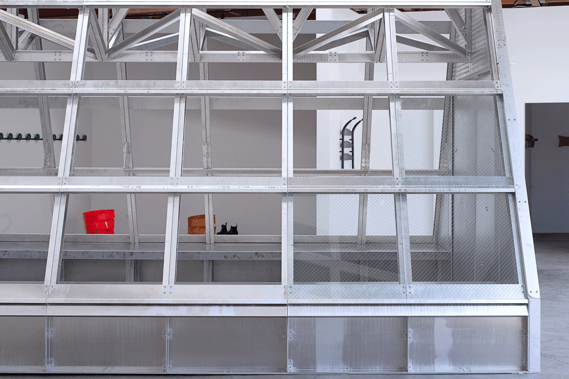
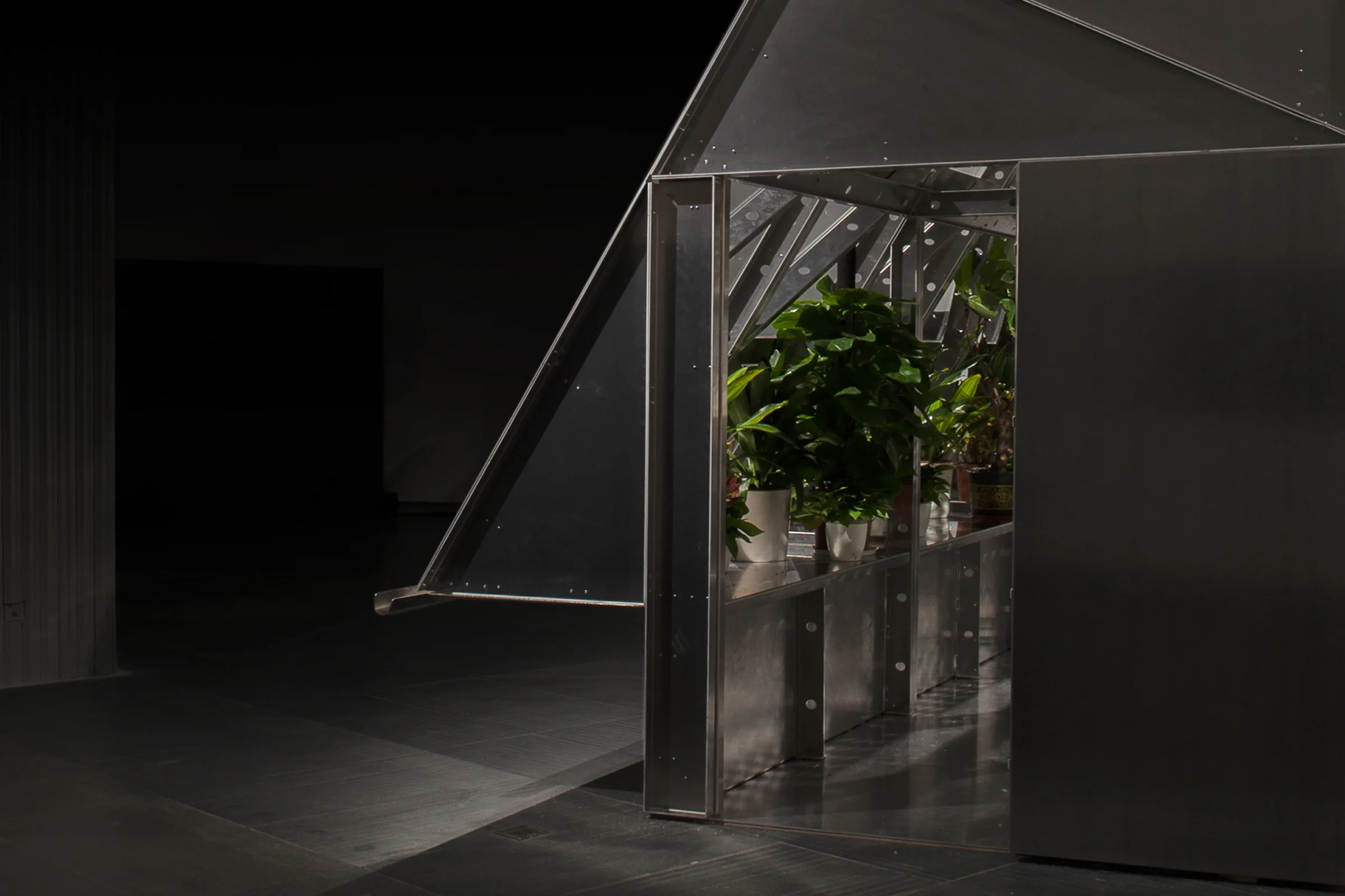
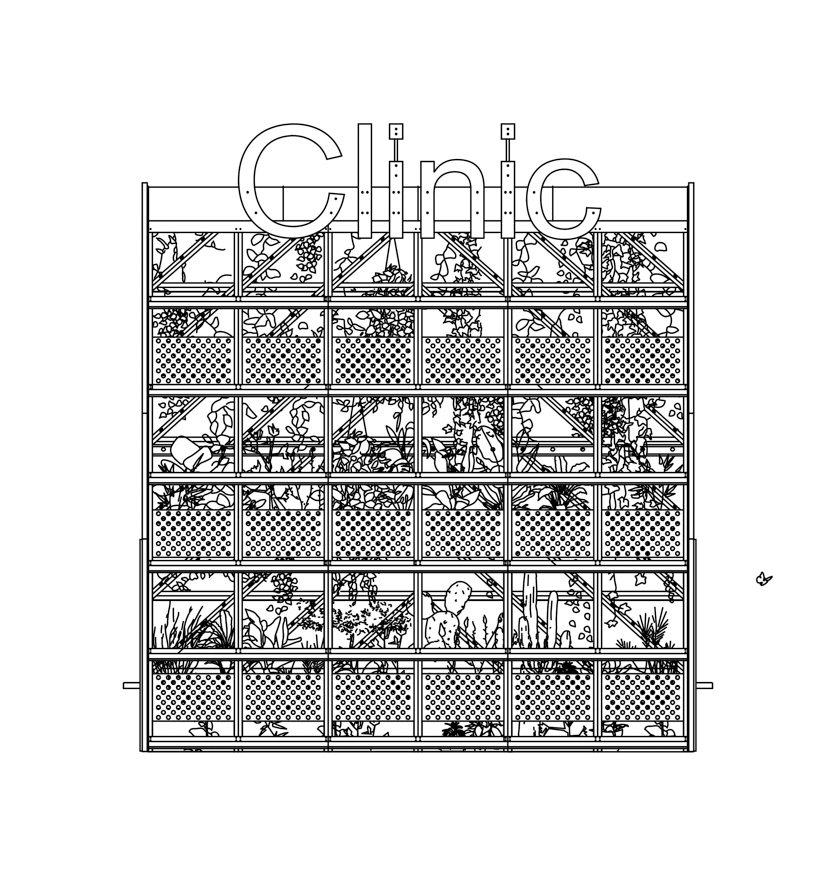
A lot of contemporary architecture looks like greenhouses. Some non-contemporary architecture too. Glass. Polycarbonate. Lightweight frames, with structure on display. Plants. A collection of small objects. Things floating within structural frames. Difference and variation, maybe for its own sake, maybe towards a multitude of beauty, maybe towards a diverse garden of architecture, maybe towards nothing in particular. 428 pieces, bolted together. Various species of aluminum parts.  About 380,000 plant species are known to us. We are surrounded and outnumbered. Community Gardens provided a place of retreat, of protest and consternation, of victory gardens, of  seed bombs, of non-western medicine and  self-care clinics and homeopathy, of collective responsibility and action, DIY green guerillas, and so on. Community greenhouses are a sort of urban infrastructure of small structures. Places to bring things and people together, to plant seeds and cultivate. This community greenhouse has a vented roof, workspaces on both the north and south sides and a mezzanine for more plants.

Project Team: Michael Meredith, Hilary Sample, James Wood

  1. 1
  2. 2
  3. 3
  4. 4
  5. 5
  6. 6
  7. 7
  8. 8
  9. 9
  10. 10
  11. 11
  12. 12
  13. 13
  14. 14

Greenhouse No. 1

Without A Specific Site, 2020–24

At least one version of Modernism began with a public greenhouse, a so-called crystal palace with steel painted sky blue. This is aluminum. No paint, although possibly someday. Lighter. Recyclable. Reflective in the right lighting. Easier to carry and put together. Made from a kit of parts. Imbued with Gothic clarity, maybe. Crystalline-ish. Crystal Lite. 290 pieces, bolted connections. Manufactured in a factory. Assembled on site within a week. An instant bubble. An atmosphere. An environment. A totalizing experience. Ol factory. Designed to move, to travel almost anywhere. And plants can visit from anywhere. An instant garden. An instant community. A community greenhouse. An exotic display of difference. A collective. A place for people to visit to restore themselves and unwind and work and meditate and rest. An allotment to grow food, outside of the marketplace, outside of work. An alternate economy. A place to cultivate care. The possibility of something better.

Project Team: Michael Meredith, Hilary Sample, James Wood, Andy Kim, Ben Dooley

  1. 1
  2. 2
  3. 3
  4. 4
  5. 5
  6. 6
  7. 7
  8. 8
  9. 9
  10. 10
  11. 11
  12. 12
  13. 13
  14. 14
  15. 15
  16. 16
  17. 17
  18. 18
  19. 19
  20. 20
  21. 21
  22. 22
  23. 23
  24. 24
  25. 25
  26. 26
  27. 27
  28. 28
  29. 29
  30. 30
  31. 31
  32. 32

Housing No. 16, With 38 Towers

Chacarita Alta, Asunción, Paraguay, 2019–Under Construction

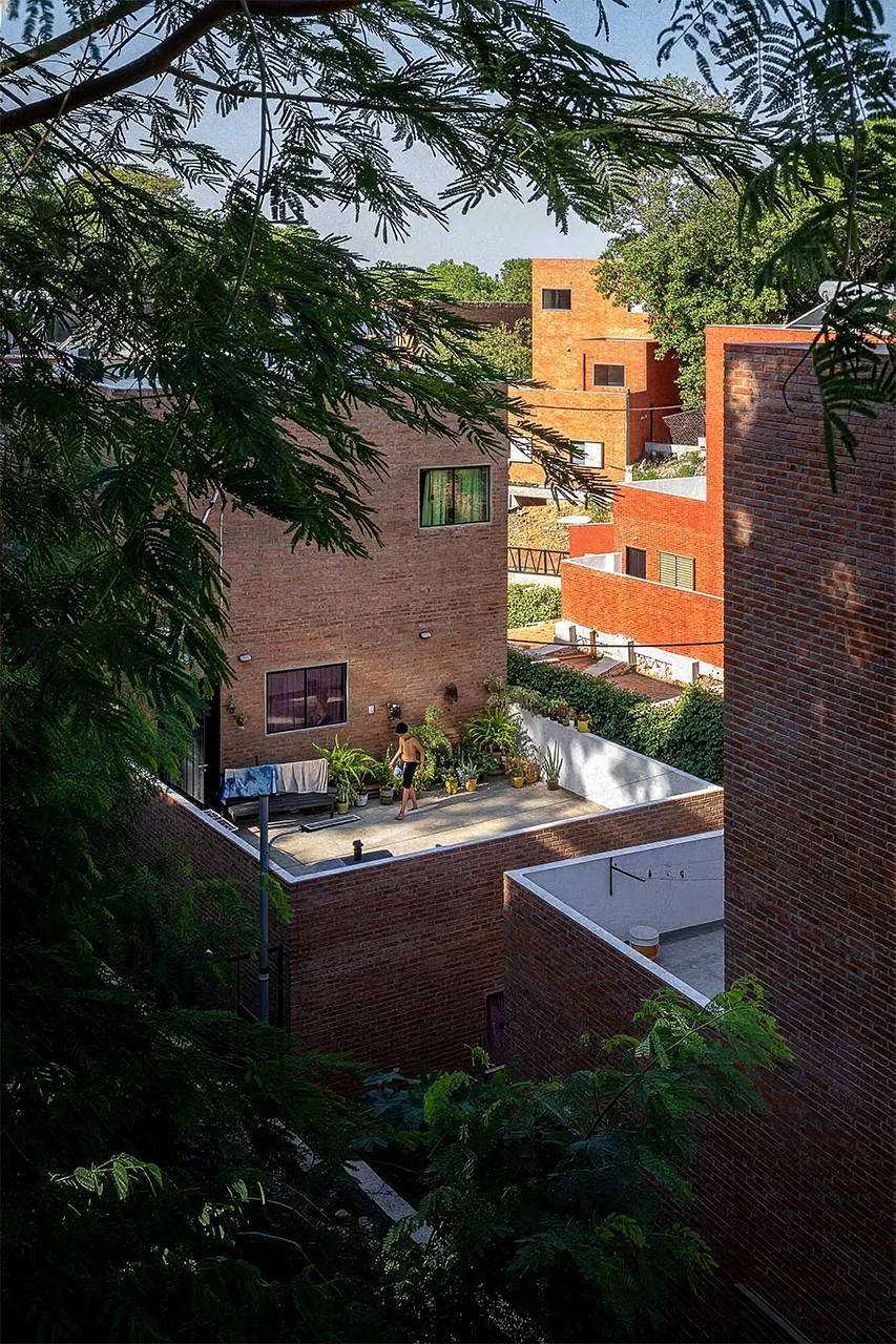
The site is an informal settlement along a canal in central Asuncion, a 15 minute walk from the Government Palace of the President of Paraguay. Each unit of new housing replaces an existing dwelling and is for an existing resident. A spreadsheet was given. The residents’ ages, genders, family ties, disabilities, and illnesses like depression, high blood pressure, hypertension, bad hips, and so on, were give to us. Extended families were listed, and kept together. Spatial requirements were listed, for instance, if someone needs to be on the ground floor, or next to someone else, or in a specific location. Empathy via excel. No unit is exactly the same, because each site is unique and each resident is unique. Some single adults, a family of 10, everything in-between. Up to 5 generations. Not-nuclear. Sometimes nuclear. Some residents live in the 38 towers (a 3.5m x 3.5m plan with 4 stories, terraces and roof access) located on 12 unique sites, each with direct access to a public pedestrian street. Some live in the base level, which contains courtyard houses for individuals and small families with 79 total units, again with direct access to a public street. Commercial spaces were provided for businesses that were there before, and small pockets of shared public space. Topography, neighbors, and infrastructure define the limits of the building. The base plans are irregular and specific to their situation. A field of repetitive towers, resting on a field of irregular gardens. Light and air everywhere. A pedestrian city. Passive systems, sustainable, low energy, spaces for food production, not typical contemporary social housing. There were periodic meetings with residents and the Paraguay Ministry of Housing.

Project Team: Michael Meredith, Hilary Sample, Tianyang Sun, James Wood

In collaboration with adamo-faiden and Equipo de Architectura

  1. 1
  2. 2
  3. 3
  1. 4
  2. 5
  3. 6
  4. 7
  5. 8
  6. 9
  7. 10
  8. 11
  1. 12
  2. 13
  3. 14
  4. 15
  5. 16
  6. 17
  7. 18
  8. 19

A Book on Making a Petite École

Book, 158 pages. New York: Artist book, 2019; 2nd ed., Barcelona: ACTAR, 2022. 19" x 22" (original), 9.5" x 12.75" (second edition).

With contributions from Sebastián Adamo & Marcelo Faiden, Yussef Agbo-Ola, Sir David Adjaye, Xavi Laida Aguirre, Stan Allen, Benjamin Aranda, Assemble, Tatiana Bilbao, Bureau Spectacular, Marlon Blackwell, Galo Canizares & Stephanie Sang Delgado, Sean Canty, Jan De Vylder, Ambra Fabi & Kersten Geers, fala, First Office, Antón García-Abril & Débora Mesa, Go Hasegawa, Steven Holl & Dimitra Tsachrelia, Wonne Ickx/PRODUCTORA, Florian Idenburg & Jing Liu, Sam Jacob, Andrés Jacque, Johnston Marklee, Ladi’Sasha Jones, l’AUC, LEFT Architects, Toshiko Mori, Catherine Mosbach, Umberto Napolitano, Daniel Norell & Einar Rodhe, Lütjens, Pezo von Ellrichshausen, Mónica Ponce de León, Pier Paolo Tamburelli, Bolle Tham & Martin Videgård, UrbanLab, Welcome Projects, WORKac with Ayah Wood.

Project Team: Michael Meredith, Hilary Sample, Paul Ruppert, Lafina Eptaminitaki, Charles Dorrance-King, Julia Muntean, Ben Dooley
Graphic Design: Studio Lin

  1. 1
  1. 2
  2. 3
  3. 4
  4. 5
  5. 6

Rooftop No. 1, Observatory, Canopy, Open Space

Brooklyn, New York, 2019

Once upon a time, people peered into the night sky searching for something, understanding that the moon, the planets, and the stars were connected with the earthly, the bodily. Observing our surroundings was a fundamental social and cultural act, something translated and recorded and represented, collected and contrived, posted and commented, told and retold. We built instruments to measure and map. To help communicate, help us understand our world and ourselves. Art and Architecture was one of these instruments, something that exists between here and there. Tall mounds formed, altars constructed, temples built, pyramids, domes, and observatories. This is a circular canopy, providing shelter from rain and the sun, allowing for different events, operating like an architectural instrument. The canopy collects various, almost ready-made, architectural elements: A Chimney, Deck, Roof, Dome, Stairs, Elevator, Sign…. This is a map, providing an experience of the night sky no matter the weather or light conditions, animating and enlivening the space below it. We can adjust the night sky map to a specific date or time to mark its importance, a sort of flattened Cenotaph of Newton. The canopy is a radiant surface. We partnered with Dr. Forrest Meggers to provide radiant heating and cooling, allowing for a more radically open observatory, a comfortable space for outdoor lectures, dinners and star gazing events.

Project Team: Michael Meredith, Hilary Sample, James Wood, Andy Kim, Ben Dooley, Yifei Yang, Joel McCullough

  1. 1
  2. 2
  3. 3
  4. 4
  5. 5
  6. 6
  7. 7
  8. 8
  9. 9
  10. 10
  11. 11
  12. 12
  13. 13
  14. 14
  15. 15
  16. 16
  17. 17
  18. 18
  19. 19
  20. 20
  21. 21
  22. 22
  23. 23
  24. 24

Winery No. 1, In a Valley

Mendoza, Argentina, 2021–25

4 walls. Approximately 5.5 meters tall. Approximately 58 meters long. Almost north-south. 10 almost squares per wall. 40 almost squares total. The repetitive rhythm of structural piers. The soft irregular landscape. 3000 square meters built underground, filling an existing valley. The walls step up the hillside, looking like remnants of a dam of some long-dried-up river, overgrown. Something like the archaeological site of a Roman aqueduct or a forgotten James Wines project or a buried factory. It is where the natural world and the landscape surpasses any architecture. Orienting everyone who comes there to the ground around them, the vineyards and the mountains beyond. El Plato: 60km NW. Tupungato 80km SW.

Also, there were many studies for additional pavilions and furniture.

Project Team: Michael Meredith, Hilary Sample, Tianyang Sun, James Wood

In collaboration with adamo-faiden

  1. 1
  2. 2
  3. 3
  4. 4
  5. 5
  6. 6
  7. 7
  8. 8
  9. 9
  10. 10
  11. 11
  12. 12
  13. 13
  14. 14
  15. 15
  16. 16
  17. 17
  18. 18
  19. 19
  20. 20
  21. 21
  22. 22
  23. 23
  24. 24
  25. 25
  26. 26
  27. 27
  28. 28

House No. 22, With Sunken Courtyard

Location Withheld at Request, 2022

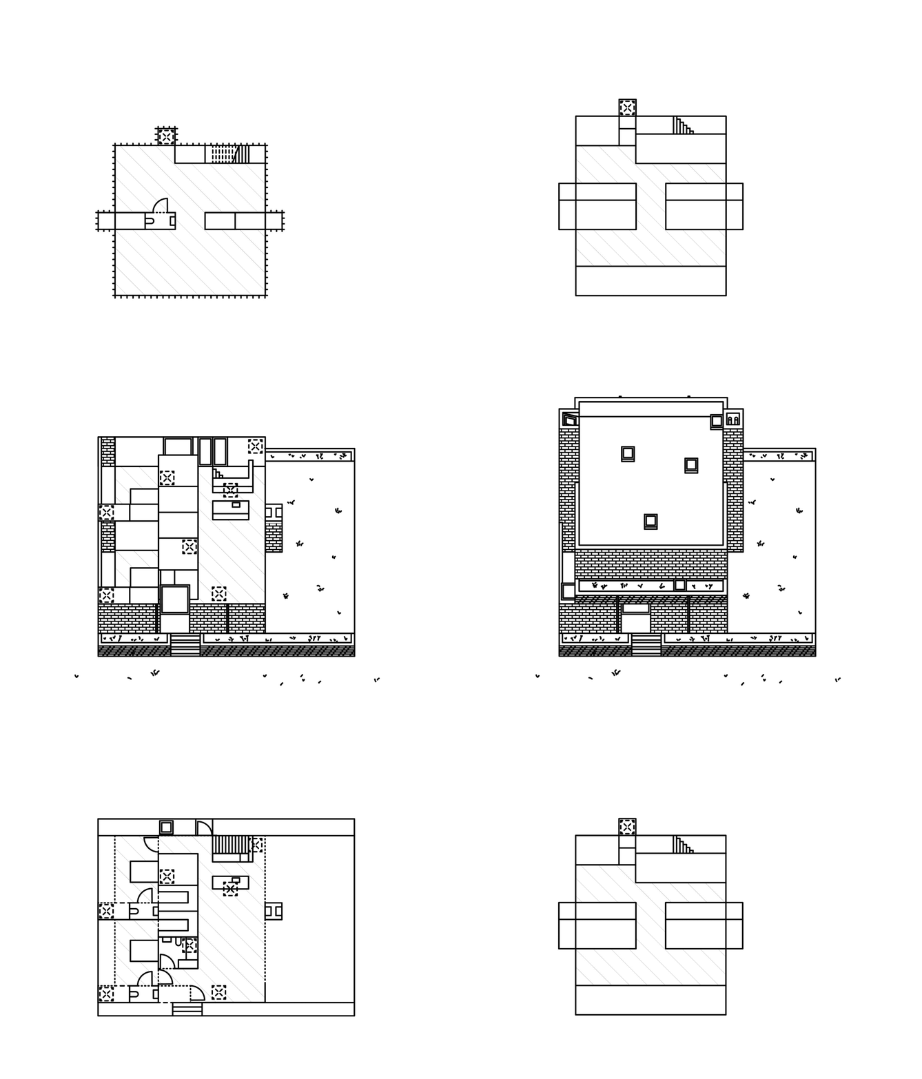
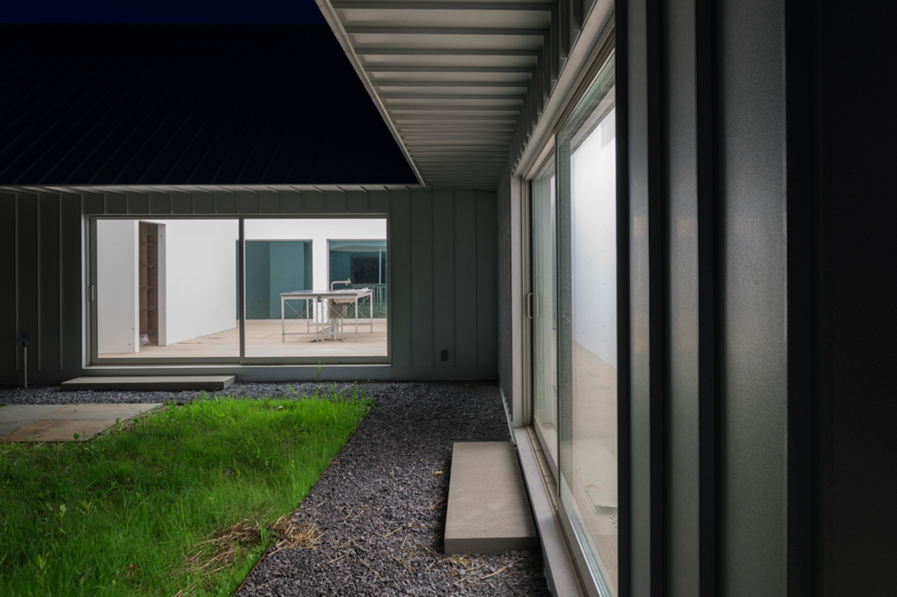
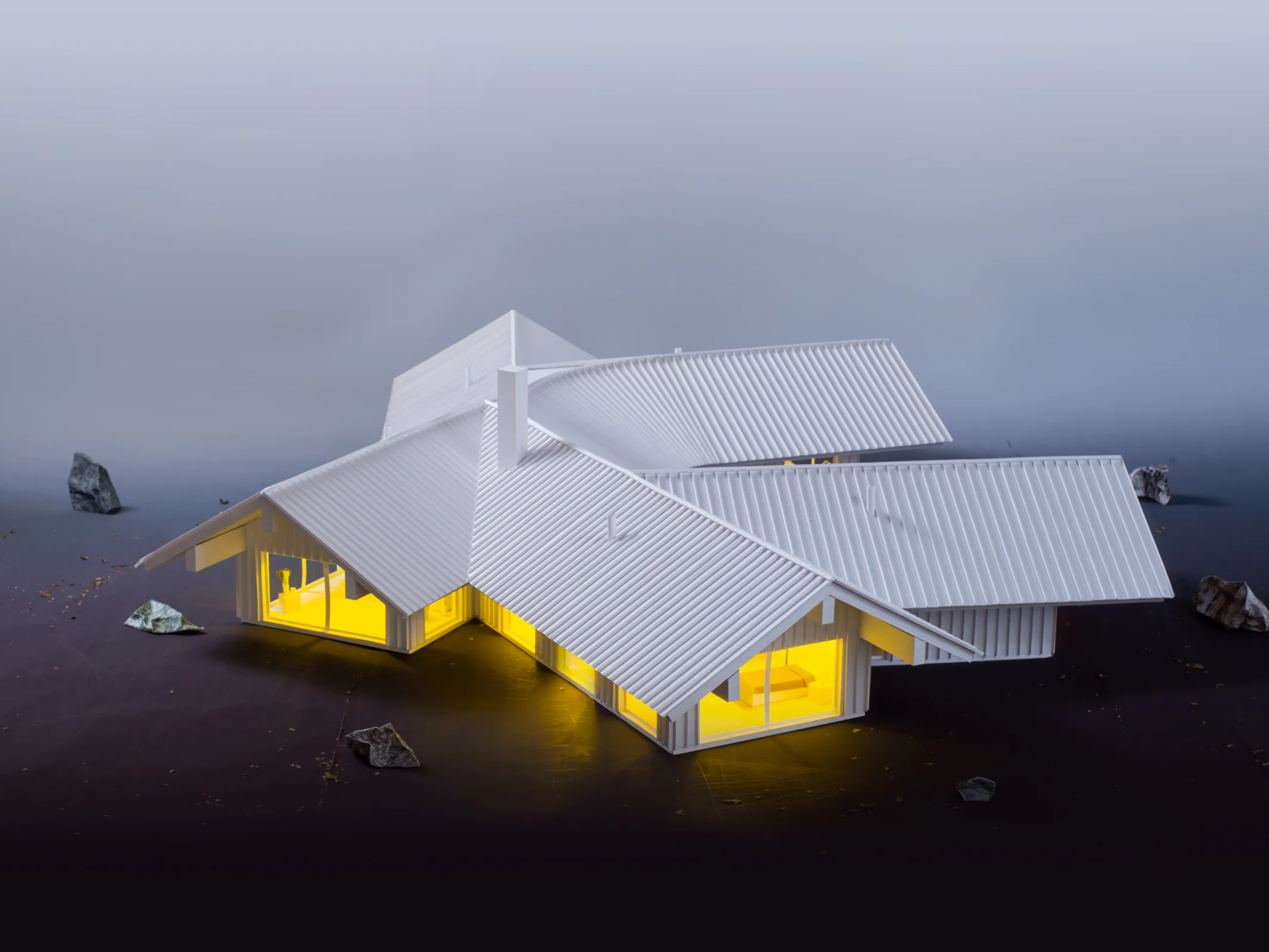
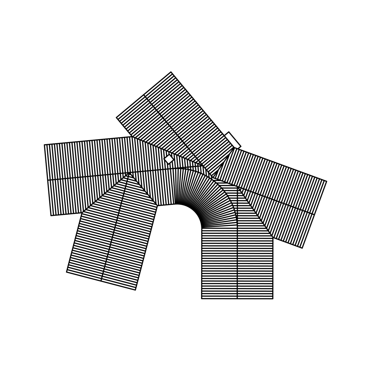
The house is built into the ground, with 1 story of collective, domestic spaces above ground, and 1 of individual, more private spaces below. Everything is connected by and revolves around the sunken courtyard. It is an object. It is a space. It cools and animates the house, filling the 2 stories with light and air and nature. Its rotation aligns with the cardinal directions. 9 skylights/solar chimneys dot the roof, bringing in light while passively cooling the interior. The house is focused inwardly. Everything is set in motion by patterns and shapes and what is above.

Project Team: Michael Meredith, Hilary Sample, James Wood, Tanya Al Saleh, Andy Kim, Ben Dooley

  1. 1
  2. 2
  3. 3
  4. 4
  5. 5
  6. 6
  7. 7
  8. 8
  9. 9
  10. 10
  11. 11
  12. 12
  13. 13
  14. 14
  15. 15
  16. 16
  17. 17
  18. 18
  19. 19
  20. 20
  21. 21
  22. 22
  23. 23
  24. 24
  25. 25
  26. 26
  27. 27
  28. 28
  29. 29

House No. 21, With Large Eave

Jefferson, New York, 2021–22

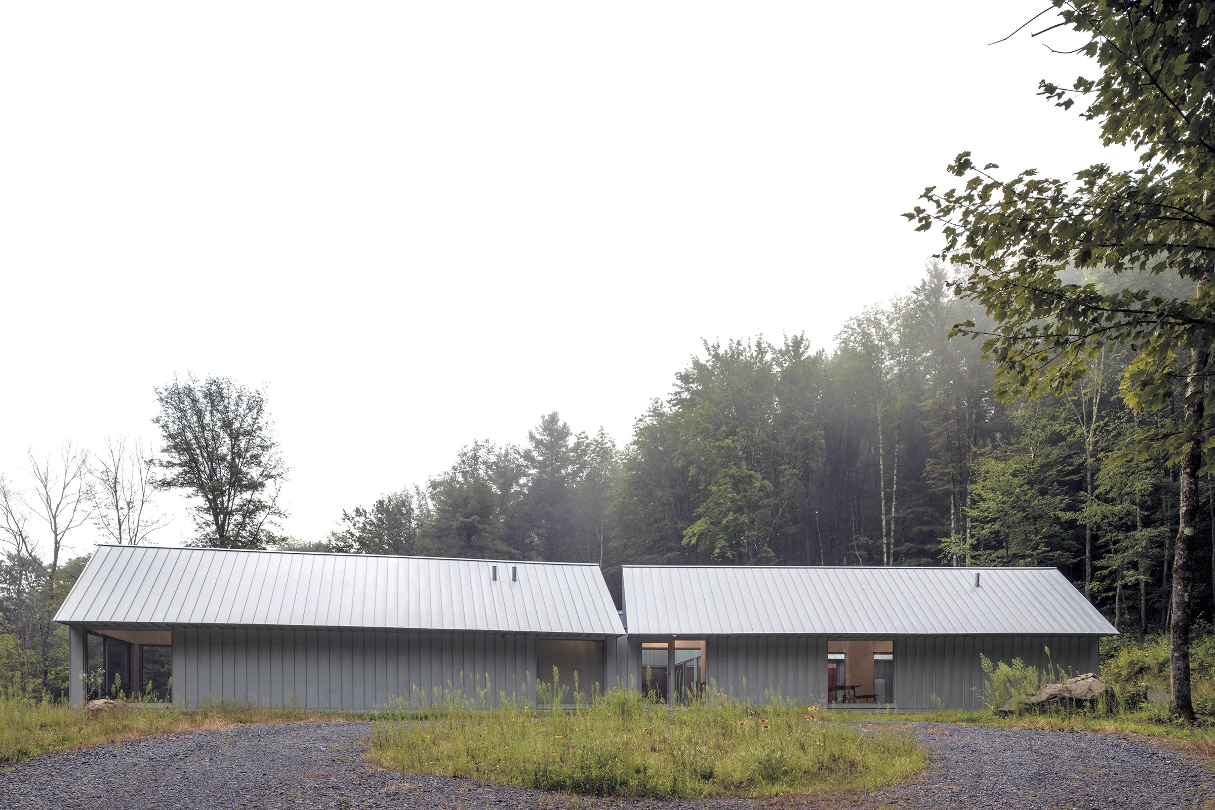
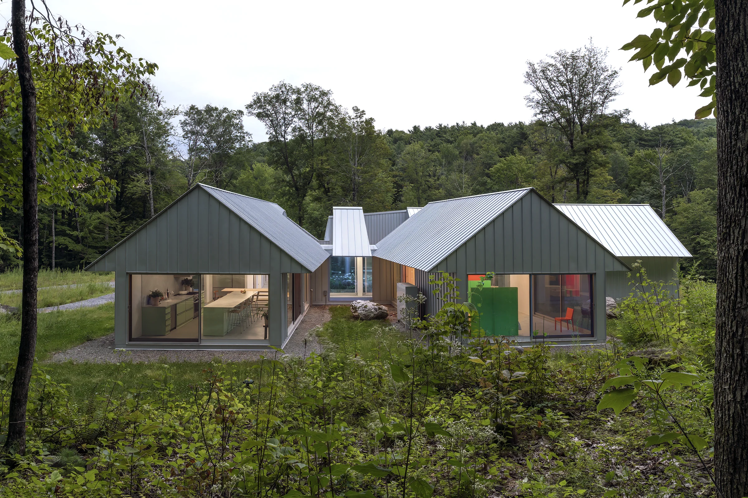
A small house with a large eave. The exterior space under the eave is the primary space of the house. This space under the eave could be a porch, a bbq grill pit with picnic tables, a bike repair shop, a makeshift podiatrist office, a photo studio, a late-night smoking lounge, a yoga retreat, a place to store partially used items that don’t fit anywhere else, a local ceramic workshop that specializes in custom mugs, a kombucha startup, a karaoke parlor, a dog’s play area, a summer camp fingerpainting venue, a temporary dance club and mosh pit, a stable for livestock, a flea market, homeopathic garden, and a garage. The attic space within the eave is the bedroom. The bathroom and kitchen are on the ground floor. It didn’t require a large budget. It is for 2 artists to spend time in nature, and to occasionally think about birds.

Project Team: Michael Meredith, Hilary Sample, Andy Kim, Ben Dooley, James Wood

  1. 1
  1. 2
  2. 3
  3. 4
  4. 5
  5. 6
  1. 7
  2. 8
  3. 9
  4. 10
  5. 11
  6. 12
  7. 13
  8. 14
  9. 15
  1. 16
  2. 17
  3. 18
  4. 19
  5. 20
  6. 21
  7. 22
  8. 23
  9. 24

MANIERA 24 MOS

Brussels, Belgium, 2021

Furniture of a New Order, Zoë Ryan

“Furniture inhabits both the world we choose to call real and the world of our imagination.”

So begins curator Suzanne Delehanty’s essay, Furniture of Another Order from 1977. Nothing seems closer to the truth these days as so many of us spend hours traversing the real and virtual spaces of our desktops, slipping between the two in a constant state of shared reality. I came across Delehanty’s essay many years ago, drawn to how artists, architects, and designers approached the making—and imagining—of furniture, at times very differently. The Institute of Contemporary Art at the University of Pennsylvania had beaten many to the punch with the exhibition memorably titled Improbable Furniture, curated by Delehanty (her essay is published in the exhibition catalogue). In it, she called for a reexamination of this paradigm of quotidian objects through the lens of work by artists who have at some point situated furniture within their output, as in the work of Max Ernst, Marcel Duchamp, Edward Kienholz, and Yayoi Kusama, or made it the very underpinnings of their practice, as in Scott Burton, for example. One of my favorite works in the show was Barbara Zucker’s Alice Inland from 1966, an oversized white wooden chair, nine feet high and crescent topped, that as Delehanty notes in the catalogue, “plays upon the viewer’s conscious and unconscious modes of thought.” The image of the work in the catalogue definitely plays with mine, generating discomforting echoes of “Off with her head!” as well as “Someone’s been sitting in my chair.”


Improbable Furniture appealed to me for its promiscuous take on furniture as the subject, and in some cases what determined the form, of the works on view. As Delehanty writes, furniture “can slip from the mundane to the metaphysical,” from objects that represent the world we inhabit to objects that through their scale, mode of production, and relationship to the body have become a never-ending means of experimentation, especially so in the case of the chair. Architects have throughout history also been drawn to furniture as a practical way to further probe human behavior and question social norms. Take as examples Gerrit Rietveld’s De Stijl chairs and Marcel Breuer’s Wassily Chair, Le Corbusier, Pierre Jeanneret, and Charlotte Perriand’s chaise longues and Mies van der Rohe’s Barcelona Chair from the early part of the twentieth century, or Charles and Ray Eames’ plywood versions from the 1940s. These now iconic designs grapple with everything from issues of form, production, lifestyle, an economy of means, and even hygiene. Chairs in particular continue to prove a never-ending source of inspiration, fascination, and fetish that’s hard to shake even in this saturated landscape. It seems there remains much to say.

When, for example, American architect Frank Gehry launched in the 1970s his now well-known line of chairs, ottomans, and chaise longues constructed from laminated cardboard, a utilitarian packing material found across the US, he called attention to his original intent, to create a more affordable, yet refined range. Once described as “paper furniture for penny pinchers” by the New York Times, given their lower price point (a lounge chair and ottoman were reported to be about $80 and under $30, respectively, when they launched in 1972) and availability at department stores such as Bloomingdales in New York and Marshall Field’s in Chicago, they are now coveted by collectors and in museum collections worldwide. More recently, Ghanaian-British architect David Adjaye released his Washington series of chairs in 2013 as companions to the building he designed for the National Museum of African American History and Culture in Washington, DC. The chair designs excavated references from both Africa and America, including the trade practices of the first African American slaves freed in the Southern states of America, who went on to create the visual iconography of towns such as Charleston and Louisiana. Adjaye’s team retraced the patterns of the architectural detailing of bronze balustrades and screens for homes, employing parametric modeling tools to generate a new articulation of these forms that shifts in density across both the seat and back of the chairs, to accommodate the body.

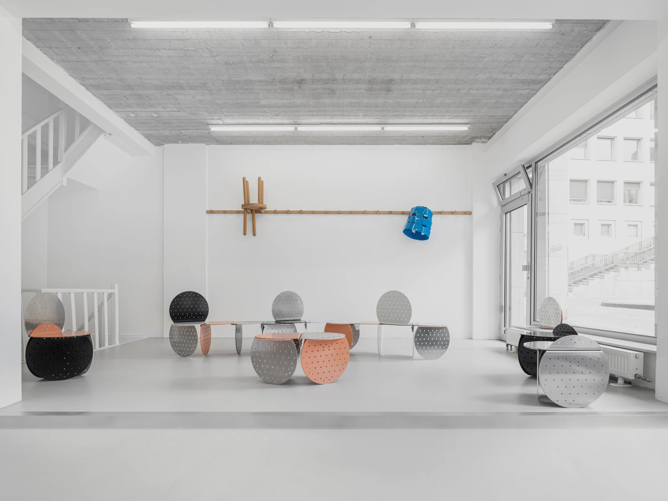
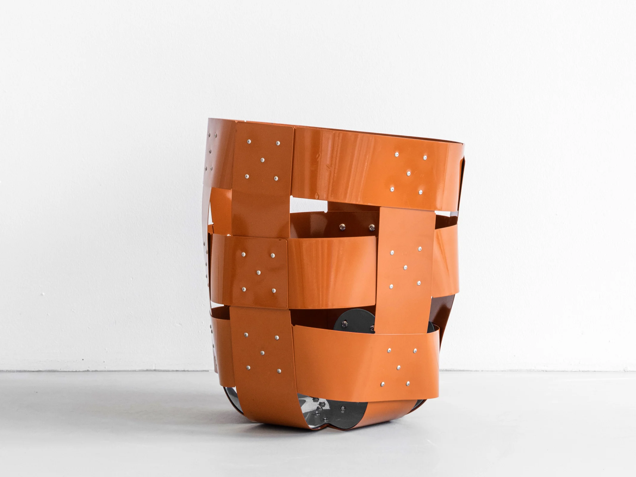
Since its founding in 2014, MANIERA Gallery has continued to provide opportunities for inventive minds to navigate between the realms of architecture, design, and art. Working to give space for ideas that expand current discourse, they recently invited Michael Meredith and Hilary Sample of New York-based architecture studio MOS, to develop some objects for the gallery, with an open brief. The chair, or seating, again became a focus for their explorations. As Sample notes, “We’re interested in making things, not buying things. If we need a seat, we make it. If we need a table, we make it.” Furniture design has long been a part of MOS’s practice. For their design for MANIERA, they determined to investigate American approaches to furniture making. They focused on what they call “a brutal economy of scale,” no doubt in response to the contemporary moment, with the need to conserve resources, be mindful of waste, and treat invention as critical. Turning to Shaker furniture as inspiration, they have designed a number of pieces, including Baskets No. 1–3, multipurpose stools/baskets/seats, sturdy enough to sit on, stand on, and to hold objects.

The Shakers were nineteenth-century America’s largest and most well-known communal utopian society, boasting thousands of Brothers and Sisters in the early 1800s. Today only a handful remain, and yet their legacy is long. Their work ethic, high-quality output, and objects made to last are concerns that continue to have currency today. MOS’s design was also motivated by the exceptional craftsmanship of Shaker objects, especially the baskets that were a staple, made with an open hexagonal weave and sturdy enough to be used to harvest fruit or drain cheese curds. With its utility and stripped-down yet elegant form, Baskets No. 1–3 exemplify the Shaker code of practice to make something useful and necessary, but also beautiful, with any decorative elements part of the design and supporting the function of the piece. The bolts that punctuate them are both functional and are the only decoration, other than color, on the piece. Available in a range of sizes and scales, the baskets/stools can seat one or two people side by side. The only thing missing is two handles, which would have governed a Shaker basket, making it easier for a pair of workers to hoist a heavy load. Rather than wood, MOS’s baskets are made from a latticework of metal strips outsourced from fabricators who send the finished parts to MOS to do the final assembly. “We have the last say,” affirms Sample. Like the Shakers who were also fastidious about quality, they live with their designs, including “failures and mistakes,” which Meredith says they learn from. With an enthusiasm for a hands-on approach that was shared by the Shaker brethren, they test out their work in their studio and home to ensure that it is fit for its purpose.

MOS’s interest in weaving techniques was born a number of years ago when Sample made what she calls tape blankets. Living in the Netherlands, and without the time and access to a loom to weave in the traditional way, she acquired rolls of double-stick colored tape. She would peel off the tape and create blankets by sticking different pieces of tape together in a crisscross formation. “It became like a sort of weaving project,” she recalls. “It was an immediate, precise form of making something, unlike architecture. I liked that.” Sample’s approach speaks to the studio’s current fascination with working with what’s available, whether materials or manufacturing processes.

Object No. 11 (Peg Bench) and Object No. 12 (Peg Chair), also for MANIERA, are other cases in point. They underscore MOS’s satisfaction in finding off the rack components that they can repurpose for new uses. This time they appropriated thick wooden broomstick handles, cutting them down to size for the back and legs to create whimsical, yet practical designs whose material origins are a part of their appeal. Other pieces include Object No. 16 (Peg Rail), a reinterpreted Shaker design, typically hung on the wall and used for hanging up coats, keys, scarves, and other quotidian stuff, as a way to organize their communal homes. Updated by MOS, their wooden design can be screwed together in different arrangements to meet individual and collective needs. Another common object found in Shaker homes is the wood stove, which MOS has rethought with their Wood Stove No.1, made from simple component parts, such as a fire box fitted to a table, for outdoor gatherings. “One of the main values of the Shakers was a precise sense of utility, every object had a specific function” says Sample, “The objects we make typically have multiple uses – legs can be back rests, stoves can be tables, baskets can be stools, or something we haven’t imagined.”

The Objects of One Part, No. 3, like their baskets, are multi-functional objects. The pieces are made from identical perforated metal panels bolted together. The rounded form, reminiscent of a child’s toy, allows many different configurations, such as a stool, chair, table, or bench. Finally, the sectional lounge chair Object No. 17 (Circular Bench) is also made from metal and looks as if it was inspired by pew seating in a Meeting House. Erected from corrugated aluminum panels, it can be aggregated to form a circle or semicircle, making it fitting for congregating indoors or out. What MOS’s collection of works has in common is the rigor with which they approach their designs based on an economy of construction, an attitude that finds an affinity with the work of the late Italian designer Enzo Mari. MOS, like Mari, put emphasis on the value of objects that have become subsumed into our daily lives, their origins forgotten or taken for granted.

Just as artists shift perspectives and open our imaginations, design too has the potential to reinterpret the familiar in ways that not only offer new typologies of objects that prompt us to question and even modify behavior, but also open space in our minds for new thinking about the physical and metaphysical relationships we have with the built environment. As MOS has shown, rather than improbable furniture, their intuitive designs are resolutely probable.

Project Team: Michael Meredith, Hilary Sample, Matthew Acer, Ben Dooley, Joel McCullough

Solo Exhibition, Maniera, Brussels, Belgium, June 19–September 18, 2021. Including Zoë Ryan, “Furniture of a New Order.”

  1. 1
  2. 2
  3. 3
  4. 4
  5. 5
  6. 6
  7. 7
  8. 8
  9. 9
  10. 10
  11. 11
  12. 12
  13. 13
  14. 14
  15. 15
  16. 16
  17. 17
  18. 18
  19. 19
  20. 20
  21. 21
  22. 22
  23. 23
  24. 24
  25. 25
  26. 26
  27. 27
  28. 28
  29. 29
  30. 30
  31. 31
  32. 32
  33. 33

Casa No. 1–17

Book, 160 pages. Milan: Libra. Including Stan Allen, “[La città e la casa],” and MOS, “The Quote Un-Quote [Apro e chiudo virgolette].” 12cm x 21cm.

“The Quote Un-Quote”

We look back at our own work every so often, making sense of it. It is impossible. Something slips away. Something enters the scene. We never quite grasp it. Architecture especially. We try. Others help. Each sees what they want to see. Things say something, and then something different to another. None of us are totally right, but others might understand it better. Although, even if they told us, I’m not sure we’d believe them. We take it personally. Our work is personal. I’m unsure who said it first. But someone said your work is quote un-quote Neopomo. Neo-Post-Modern. They said we helped establish it in the academy. Someone else said we were leaders of the movement. These weren’t compliments. We didn’t even know NPM was a thing. We never cared about semiotics or signifiers or salmon-colored faux classical pediments. We don’t remember the classical orders, some of us. We never cared about architecture as a language. We never heard what architecture was saying. It only mumbles. We cared about building things, about materials, proportions, and construction. We liked vernacular architecture because it was practical, it wasn’t trying to mean anything, not because we were referencing something. Everything seems to reference something else nowadays. If you’re not working on a project of measurable data or technology or performance, then everything is in quotes, regardless of intent.

When we started, the world around us seemed to be about progress through technology, data, complexity, animation, fabrication, performance, simulation, mass customization, a newfound control over architecture. Anything other than that seemed regressive. That word neopomo sounded so weird. N-E-O-P-O-M-O. They spelled it out for us. We stared blankly in return, trying to understand if they were right. Maybe they were. Some people want history to repeat itself. We don’t. Although, sometimes it repeats itself regardless. Quote Un-Quote. Cute chubby objects. Axonometrics. Color. Aggregation. Typology. Square Windows. Maybe we thought it was good or beautiful, and not too expensive to build. Maybe we could do it with our own software, open source. Maybe we didn’t think enough. We liked little to no expression. We liked simple drawings and forms and shapes. We liked boredom. It seemed far more exciting than the supposedly exciting stuff. We liked blankness. We liked readymades. We liked vaguely familiar things. We liked economic construction. Pitched roofs don’t mean anything particular to us. They’re cheap. They work. We liked the overlooked beauty of the world around us. We didn’t like the work being about us. We disliked design’s classism and luxury. We liked Bernd and Hilla Becher photographs. We liked non-representation representation. We didn’t like technological expressionism. Too much technology. Technology can only be corporate nowadays. It’s all unseen. The corporate takeover of everything. It requires money, a lot of money. We are afraid of money. We don’t like what money does to the world. We didn’t believe the hyperbolic claims of progress, although we want progress, we want things to get better. It doesn’t seem better. We overheard a professor of public health say, when I hear architects talking about some new thing, or new material, I just think of the future health problems. If you’re thoughtful, nothing is as easy as it seems. We didn’t believe in a single institutional linear narrative for the field. We liked taking things apart. We liked putting things together. We liked buildings. We liked things in the world. We hoped our work offered a way of being in the world to others. We still do. Have you noticed how everything is related to something else. Every object has an infinite web of connections. They’re impossible to control. We don’t want to control them. Buildings just quietly sit there as the world changes around and within them. Perhaps it’s all about personal taste, perhaps it’s just two extremes playing out simultaneously – the incredibly personal and the vast array of references. We wanted a non-style style. We didn’t want fancy or expensive. We wanted to avoid something. We numbered. We repeated. We repeated with slight differences. We wanted to be personal without being expressionist. We weren’t of one mind.

Graphic Design: Studio Lin

  1. 1
  1. 2
  2. 3
  3. 4
  4. 5
  5. 6

Exhibition Design No. 8, (662) MOS ARCH

Princeton, New Jersey, 2022

This exhibition presents the remains of an architectural office: a collection of objects – prototypes, books, sketches, models, notes, drawings, experiments, material swatches, paper with a concentration on smallness and smaller-scale work. The organization of the exhibition mirrors our little office, with a large table where things accumulate. Nothing is separated into categories or organized by project or theme. Everything simply exists together as part of a landscape of things that are made, with multiple scales, formats, happening in parallel and in conversation by their proximity.

When assembling work for the exhibition, we thought about our work as a sort of spam, spam architecture. As the artist Hito Steyerl writes in “Digital Debris: Spam and Scam,” “Contemporary electronic spam tries to extract an improbable spark of value from an inattentive crowd by means of inundation. But to become spam – that is, to fully identify with its unrealized promise – means to spark an improbable element of commonality between different forms of existence, to become a public thing, a cheerful incarnation of data-based wreckage.” While architecture is obviously different from spam, spam architecture is repetitive, inexpensive, and without signature. It circulates, relying on representation. And once you start looking for it, it is everywhere. The general mode of disciplinary communication as well as protest, theory, commentary, and self-promotion appear similar, as spam. Everything arrives, notifying us of its arrival. Everything tries to hold our attention. And then everything is quickly replaced by the next thing, and the next, ad infinitum. A lot of architectural representations circulating today feel like spam. MOS makes a lot of stuff, all the time, many times without clients, on many platforms, through various media. We ourselves are constantly reaching out, in the hope of finding a common ground within our fragmented attention. We produce spam architecture. And perhaps paradoxically, as much as we spam, architecture’s physicality, collaboration, and use (both functional and cultural) make it unlike spam. Although architecture repeats and circulates, it doesn’t need to constantly notify the world about what it is doing. It usually does this by simply sitting there quietly, sometimes on an office table, at even the smallest scale.

Curators: Michael Meredith, Hilary Sample, Ben Dooley, Carly Richman, James Wood, Andy Kim, Jacqueline Mix
Graphic Design: Studio Lin
Photography: Michael Vahrenwald
Exhibition Manager: Kira McDonald
Fabrication: Cole Cataneo, James Wood, Andy Kim, Ryan Shin, House of Varona

North Gallery, Princeton University School of Architecture, Princeton, New Jersey, February 22–April 22, 2022

  1. 1
  1. 2
  2. 3
  3. 4
  4. 5
  5. 6
  6. 7
  7. 8
  8. 9
  9. 10
  10. 11
  11. 12
  12. 13
  13. 14
  14. 15
  15. 16
  16. 17
  17. 18
  18. 19
  1. 20
  2. 21
  3. 22
  4. 23
  5. 24
  6. 25
  7. 26
  8. 27
  9. 28
  10. 29
  11. 30
  12. 31
  13. 32
  14. 33
  15. 34
  16. 35
  17. 36
  18. 37
  19. 38
  20. 39
  21. 40
  22. 41
  23. 42
  24. 43
  25. 44
  26. 45
  27. 46
  28. 47
  29. 48
  30. 49
  31. 50
  32. 51
  33. 52
  34. 53
  35. 54
  36. 55
  37. 56
  38. 57
  39. 58
  40. 59
  41. 60
  42. 61
  43. 62
  44. 63
  45. 64
  46. 65
  47. 66
  48. 67
  49. 68
  50. 69
  51. 70
  52. 71
  53. 72
  54. 73
  55. 74
  56. 75
  57. 76
  58. 77
  59. 78

Vacant Spaces NY

Book, 608 pages. New York: ACTAR. 6” x 9”.

This project began by walking around our neighborhood noticing empty storefronts. Once we saw them, they were everywhere. They followed us, appearing quietly throughout New York City. Many with no signage, no “for rent,” no “coming soon.” Usually empty, sometimes dusty, sometimes with brown paper covering the glass. Now, vacancy has only increased. In the densest city in the United States. During a housing crisis. Throughout a pandemic. The quantity of vacant spaces is anyone’s best guess. It’s only partially documented. They hide in plain sight.
Within the city, there are multiple vacancies – retail, commercial, office – but storefronts and street-level spaces are the most noticeable. A majority are claimed as losses for tax write-offs. As we have found, some large vacancies persist for years. An insistence on higher rents inflates profits and value, maintaining inflated property values throughout the city. Meanwhile, an immense housing shortage grows worse.

The basic provocation of this study is that we do not need to solve large-scale problems with large-scale solutions, with more building, with additional infrastructure, with huge investments. Solutions exist that avoid developers and those who have continuously profiteered off of what should be considered a fundamental right. Possibilities exist that don’t take 5–8 years to develop, that reinvigorate street life, that don’t require massive investment with disproportionate returns, that are incremental and equitably distributed throughout the city. Housing and other social services should infiltrate our city through vacant space!

We look at these immense retail vacancies as akin to the loft spaces left as Lower Manhattan deindustrialized in the late 1950s and early ’60s. During this time, light manufacturing such as plastic warehouses, paper recycling facilities, and garment factories, moved from SoHo out of the city or went out of business entirely.1 Manufacturing changed. Vacant lofts transformed into inexpensive live-work spaces. Still zoned for industrial use, these lost apartments were illegal at first. But community groups formed quickly and fought successfully for policy changes. Sometimes solutions to problems are already here, around us, if we rethink our assumptions, if we imagine other possibilities, and if we organize.

This research documents a small portion of the vacant spaces in Manhattan: those that have been reported. We worked with students from Princeton University’s School of Architecture along with our architecture office, MOS, to document and draw the available data. New York City does not keep track of business or residential vacancies, instead relying on private companies to document and provide information. In their 2019 report on retail vacancy between 2007–2017, the City Comptroller contracted a private company, LiveXYZ, to document vacancies in the city. The information is opaque; their sources and methodologies aren’t clear. Larger, corporate real estate holders often report their vacancies as losses, but many others do not. Because of this, it is nearly impossible to understand the extent of vacant spaces in New York. Most data is under-reported. Harlem, where we live, is one neighborhood that is under reported. Our observations do not align with the reported data; we live our daily lives alongside entire blocks of vacant storefronts that are missing from data.

The following document is organized from large to small, general to specific. It begins by looking at vacancy within the United States and continues down to each Manhattan neighborhood, where we zoom into specific vacant spaces, where we have provided as case studies that imagine some possibilities for transforming current vacant spaces into housing or social services. There is also a section on Covid 19, which infiltrated New York during our research. As a whole, this document is not meant to provide specific solutions. The data is incomplete. Case studies are limited. We are not policy experts or data analysts or urban planners. Instead, it is simply meant to show something we have taken for granted, vacant spaces, taking part in a collective process of imagining a better city.

Notes
1 See Aaron Shkuda, The Lofts of SoHo: Gentrification, Art, and Industry in New York, 1950–1980 (Chicago: University of Chicago Press, 2016).

Project Team: Michael Meredith, Hilary Sample, Ben Dooley, Andy Kim, Vicky Cao, Reese Lewis, Jacqueline Mix, Hannah Lucia Terry, Cristina Terricabras, Carly Richman
Graphic Design: Studio Lin

  1. 1
  1. 2
  2. 3
  3. 4
  4. 5
  5. 6

House No. 20, With A Curve

Dutchess County, New York, 2019–2020

It began as a house for two families, and ended as a house for one. There was a pandemic happening. It was a process. We tried to do what they asked. The site is amazing. Remote. Wooded. Stone walls. They wanted something beautiful. Something that didn’t cost a lot. A place to raise children. Everyone wants architects to promise what it will cost. We don’t deal with this enough in school. We are asked to do the impossible. Something spectacular and responsible. Uniquely beautiful and affordable. Unlike anything we’ve done before, and similar. Something larger than legally possible. We looked through old sketchbooks, unearthed previous deadends. A curve was introduced.

Project Team: Michael Meredith, Hilary Sample, Matthew Acer, Qiazi Chen, Reese Greenlee, James Wood

  1. 1
  2. 2
  3. 3
  4. 4
  5. 5
  1. 6
  2. 7
  3. 8
  4. 9
  5. 10
  6. 11
  7. 12
  8. 13
  9. 14
  10. 15
  11. 16
  12. 17
  13. 18
  14. 19
  15. 20
  16. 21
  17. 22
  18. 23
  19. 24
  1. 25
  2. 26
  3. 27
  4. 28
  5. 29
  6. 30
  7. 31
  8. 32
  1. 33
  2. 34
  3. 35
  4. 36
  5. 37
  6. 38
  7. 39
  8. 40
  9. 41
  10. 42
  11. 43
  12. 44

House No. 19, On A Slope

Location Withheld at Request, 2018

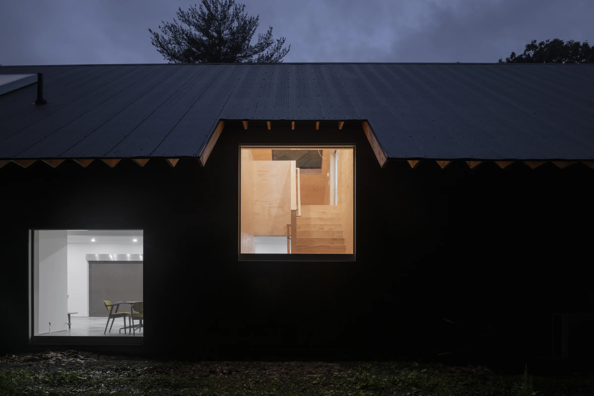
Built into a slope. Half of an A frame. Oversized steps. It has a single large sloped roof supported by a grid of beams. Exposed structure underneath. A waffle. A cap to something. A lid. A coin. A funny beret. A satellite dish. A sign that fell over. Almost a circle. All the spaces sit under the large roof, shifting horizontally and vertically to create the living space, the kitchen and bedrooms. The bedrooms have triangle shaped clerestories. Maybe we will add a lower window. We like the space focused on the slope, on being on a slope. Light flows around and underneath. Maybe there will be a skylight. Maybe not, we’re afraid of leaks. Maybe there will be solar panels. Maybe not. There will be guards to stop snow sliding into the entry. The entry pad will be heated, no need to shovel. The earth provides thermal mass and insulation. It will feel warm. A hobbit hut. A place to hide. The North is protected. The South is accessible. The whole house is lined with windows on either end. It is entered from the top or the bottom of the slope. There are 2 entrances. In/Out. On/Off. Up/Down. In-between. Maybe.

Project Team: Michael Meredith, Hilary Sample, Matthew Acer, Anam Izhar Ahmed, Qiazi Chen, Andy Kim

  1. 1
  2. 2
  3. 3
  4. 4
  5. 5
  6. 6
  7. 7
  8. 8
  9. 9
  10. 10
  11. 11
  12. 12
  13. 13
  14. 14
  15. 15
  16. 16
  17. 17

“Over/Under”

Los Angeles, California, 2020

A holder of toilet paper.

“Over/Under” Marta, Los Angeles, California, September 10–November 1, 2020

  1. 1
  2. 2
  3. 3
  4. 4
  5. 5
  6. 6

House No. 18, Along a Ridge

Columbus, Indiana, 2019–In Progress

Long and narrow. Based upon a 10’ sheet of plywood. Bends slightly. Following the site’s ridge. Perched, looking out. Surrounded with tall trees. 3 chimneys, 1 attic and 1 light well as volumes on the roof. It doesn’t look like a house, maybe something you’d find in a trailer park designed by William Morris, maybe Villa Le Lac. It looks like a wall, or a line. It is a straw sucking up space. It is a zipper stitching things together and holding them apart. It is a bent telescope. 2 bedrooms, 1 bathroom, a kitchen and living space that opens on to large decks overlooking the abundance of trees. There are wood burning stoves throughout to heat the spaces. There are passive ventilation chimneys. We like chimneys, too much. We can’t quit them. Bedrooms are on both ends. The central long space has some large and some small windows. Platforms and views radiate. A minty green spiral stair takes you to a small studio and the roof. A studio to draw and read and design very precise furniture. On the roof you can see the stars.

Project Team: Michael Meredith, Hilary Sample, Matthew Acer, Anam Izhar Ahmed, Qiazi Chen, Cristina Terricabras

  1. 1
  2. 2
  3. 3
  4. 4
  5. 5
  6. 6
  7. 7
  8. 8
  9. 9
  10. 10
  11. 11
  12. 12
  13. 13
  14. 14
  15. 15
  16. 16
  17. 17
  18. 18
  19. 19
  20. 20
  21. 21
  1. 22
  2. 23
  3. 24
  4. 25
  5. 26
  6. 27

Mixed Use No. 4, With 2 Spiral Stairs

Mexico City, Mexico, 2020

A corner lot. A nondescript concrete building. Bush hammered. Terrazzo. An unsurprising urban rectangular volume. Squarish. Parking below ground, open space on the roof. 2 apartments side by side. An architecture office in the base. Some prerequisites. 46 square openings. 34 Windows. Composed Non-Composed. 1 slipped. Stable Unstable. An entry. 2 cylinders. 2 spiral staircases at the building’s center. Ascending in opposite directions. Serving opposite sides. Rotational symmetry. Between 2 thick “walls.” Services and storage inside. Open space beyond. Bare. Flexible. Empty. Versatile. For work. For life. Lots of concrete. Collaborating, discussing possibilities. Waiting for the contractor’s approvals. The specifics were to be left up to the occupants. Use. Rent. Subdivide. Airbnb. Whatever. We all know how quickly things can change.

Project Team: Michael Meredith, Hilary Sample, Paul Ruppert, Lafina Eptaminitaki

In collaboration with Isidoro Michan-Guindi

  1. 1
  1. 2
  2. 3
  1. 4
  2. 5
  3. 6
  1. 7
  2. 8

Apartment No. 3, With Large Skylight

New York, New York, 2020–23

An apartment with a large skylight. The top floor of an old artist’s loft. Plywood. Custom Furniture. Bar Stools. Stools. Table. Chairs. Daybed. Towel Bars. Hooks. Floor Light. Bits of Color. Generous. Space. Warm. Light. Wonderful client. Thoughtful. Kind. Not always easy during construction. Started with a pandemic, ended with a vaccine.

Project Team: Michael Meredith, Hilary Sample, Joel McCullough, Qiazi Chen, Matthew Acer
Photography: Michael Vahrenwald

  1. 1
  1. 2
  2. 3
  3. 4
  4. 5
  5. 6
  6. 7
  7. 8
  8. 9
  9. 10
  10. 11
  11. 12
  12. 13
  13. 14
  14. 15
  15. 16
  1. 17
  2. 18
  1. 19
  2. 20
  3. 21
  4. 22
  5. 23
  6. 24
  7. 25
  8. 26
  9. 27
  10. 28
  11. 29
  12. 30
  13. 31
  14. 32
  15. 33
  16. 34
  17. 35
  18. 36
  19. 37
  20. 38
  21. 39
  22. 40
  23. 41
  24. 42
  25. 43
  26. 44
  27. 45

Artist Retreat No. 2

Hudson, New York, 2019–In Progress

A long house collective art studio sunken into the ground.  Cabins for artists in residence scattered within a beautiful site. Overgrown. Art in the landscape. Serial. One after another. A series of small cabins. Some alone, some paired. Large thick living roof. T shape. Wild. 4 elements. A stove, slightly off-center. A roof, square and overhanging. An enclosure, in folded weathering steel, or maybe aluminum. A retreat. Square windows. A mound, on the roof. Or smaller mounds. Landscaped like the surroundings. Deep shelves as structural braces. Plywood interior. Material. Folded steel outside and above. Weathering Steel. Some horizontal, some vertical. Some filled with tapered insulation. Everything based on a 2’ grid. Think of architecture in terms of sheet material. As long as standard sheets will allow. We imagined building things ourselves. We do not want to build it, but do what we have to. We began with everything in metal and foam. We thought about the least labor. The least amount of processing of material. Large. Lightweight. Things started, stopped, started, stopped, and started again. Stopped for now.

Project Team: Michael Meredith, Hilary Sample, Matthew Acer, Mark Kamish, Paul Ruppert, Lafina Eptaminitaki

  1. 1
  2. 2
  3. 3
  4. 4
  5. 5
  6. 6
  7. 7
  8. 8
  9. 9
  10. 10
  11. 11
  12. 12
  1. 13
  2. 14
  3. 15
  4. 16
  5. 17
  6. 18
  7. 19
  8. 20
  9. 21
  10. 22
  11. 23
  12. 24
  13. 25
  14. 26
  15. 27
  1. 28
  2. 29
  3. 30
  4. 31
  5. 32
  1. 33
  2. 34
  3. 35
  4. 36
  1. 37
  2. 38
  3. 39
  4. 40
  1. 41
  2. 42
  3. 43
  4. 44
  5. 45
  6. 46
  7. 47
  8. 48

Studio No. 4, With Flat Roof

Location Withheld at Request, 2019

A studio with a flat roof. A studio for making things. Art or anything or almost anything. It is an assembly of 120 foam blocks and more than 600 pieces of bent aluminum. The foam is scaled for infrastructure, for highways and roads, the metal is more like a mail-order shed. A piece of furniture. Or an old tin toy. Still trying to convince someone to make a foam building. Things look simple, direct. Maybe cold. All this sits atop a thick slab, floating amidst a field of trees. A low res aircraft carrier. A lot of insulation. An overweight lightweight Wright. Like rock beanbags. The present configuration arranged 3 identical volumes. Stepping. But needs might grow, and volumes may be added. 3 might become 5, or 7. If it’s too expensive it might become 2 or 1 or nothing. Or everything might be moved to another site, another field. All services and storage are held to the studio’s center, alongside a spiral stair to the roof. The flat roof can become a flatbed surface of things, a stage, a backyard, a basement, a combine, a personal junkyard. The roof is a yard. A place to relax and for everything in progress, forgotten, imagined, referenced, bought, sold. A place for things you don’t know what to do with yet.

Project Team: Michael Meredith, Hilary Sample, Lafina Eptaminitaki, Paul Ruppert

  1. 1
  2. 2
  3. 3
  4. 4
  5. 5
  6. 6
  7. 7
  8. 8
  9. 9
  10. 10
  11. 11
  12. 12
  13. 13
  14. 14
  15. 15
  16. 16
  17. 17
  18. 18
  19. 19
  20. 20

An Unfinished Encyclopedia of Scale Figures without Architecture

Book, 1,256 pages. London and Cambridge: MIT Press. Including Raymund Ryan, “Go Figure!,” and Martino Stierli, “Fare Buona Figura….” 8.25” x 11”.

“Architects Draw People,” by Michael Meredith and Hilary Sample

Ask anyone, “What do architects do?” and most will reply, “Architects draw buildings.” They will likely imagine a myopic figure, often dressed in black, huddled at her/his/their desk, obsessing over details. This image is not all wrong, but architects also draw, add, copy, or notate people to go along with everything we make. It is impossible to represent architecture without representing the human. Even when the human presence is intentionally left out or is reduced to a faceless set of measurements, it haunts architecture in its absence.

As such, the point of this book, An Unfinished Encyclopedia of Scale Figures without Architecture, is to collect various architects’ representations of life into a single document. We began this project with no strong methodology other than to cast a wide net, scouring both library and Internet to collect drawings by architects we knew to produce significant buildings and drawings or those we simply thought of at the time. Then we deleted the architecture and context of these representations to focus specifically on the humans depicted by various architects or architecture offices. If we found nothing, we noted as much. While compiling all of these images, we were surprised to find that many architects simply do not represent people. Equally surprising, we found that architects who arguably have or claim nothing in common sometimes share an attitude toward scale figures (or lack thereof). Perhaps the absence of such figures is evidence of desires for the so-called posthuman; perhaps including people simply would have obscured representation of the architecture; or perhaps the architects just didn’t get to it. Throughout the Encyclopedia one can find architects who represent the human as inchoate scribbles, draw them by hand, exaggerate features, create a style, emphasize the geometric or mechanical aspects of bodies … And architects who reference other scale figures, collage themselves as scale figures, make political statements, want to portray a mood or attitude, want to make the human as uninteresting as possible, show only backsides or only silhouettes, are eclectic, and so on. One can also see the relationship to media and technology through how architects represent people: in gaussy, transparent Photoshop silhouettes; models collaged from lifestyle glossies and on-the-street fashion blogs; soft charcoal smudge-sketches; watercolors; full-color graphic illustrations; etcetera. We tried to include broad-ranging examples; but, when skimming the Encyclopedia, please accept our apologies for those offices and buildings we have neglected to include. We did what we could to be as inclusive as possible within the relatively narrow medium of architectural publications. After all, the point was never to be complete – an impossibility nowadays – but rather to be as broad as could be managed within our given resources. And we tried. We collected over 1,000 figures produced by over 250 architects, and (with a few exceptions) we present every figure at the same scale. Scale figures are a fundamental part of any professional’s arsenal; we architects have all amassed folders upon folders on our servers filled with these fictional people. And although scale figures are only of those things that most of us take for granted in day-to-day practice, they are no doubt a disciplinary problem, a fact which became increasingly evident as we assembled the Encyclopedia. It might seem naively absurd, but as we stared at the countless figures in this book it became hard to see them as anything but a kind of global citizenry. They are Architecture’s refugees. They travel the world, popping up from time to time on reviews, and in student work. And the more we looked at them, the more we thought about both the architecture offices that created them and the wonderfully diverse world we all live in – a world which seems ever more intolerant of difference and increasingly inhuman.

Project Team: Michael Meredith, Hilary Sample, Michael Abel, Jacob Comerci, Taylor Cornelson, Michaela Friedberg, Paul Ruppert

  1. 1
  1. 2
  2. 3
  3. 4
  4. 5
  5. 6

Object No. 14, Of 1 Part

A chair made from 1 part. Rearrangeable. Many different chairs possible. Designs we can’t think of yet. Maybe a stool. Enzo Mari in aluminum, sort of. Something like a 2 x 4, but different. The number of parts can change depending on use. Extra pieces can be used for ornament. Or to pile. It’s clunky. It depends on your mood.

Project Team: Michael Meredith, Hilary Sample, Paul Ruppert

  1. 1
  1. 2
  2. 3
  3. 4
  4. 5
  5. 6
  6. 7
  7. 8
  8. 9

Housing No. 15, Co-living Rowhouse Prototype

Harlem, New York, New York, 2018–19

A co-living row house in Harlem. 6 stories tall. Efficient, whatever that means. Theoretically cheap to build, which might not mean anything. Theoretical cheap is an oxymoron. We ran some numbers. We think it’d be a nice place to live. Not sure if you agree. It’s nearly impossible to convince someone of beauty, if they don’t see it or are not open to it. 5 balconies look out onto the street. 5 balconies look out onto a backyard. The front and back of the building are separated by a collective core. Circulation. Utilities. Bathrooms. Stacked. The elevator clearance pops up. It’s polished stainless steel. Maybe there are solar panels. The roof is a garden. The ground is a garden. There is a shared garden next to the shared kitchen and dining. Collective spaces above and below. Places to gather, to find privacy, to read, to eat, to take a nap, to talk, to meet, to negotiate with others on how we should live.

Project Team: Michael Meredith, Hilary Sample, Paul Ruppert, Lafina Eptaminitaki, Julia Muntean, Yam Chumpolphaisal

  1. 1
  1. 2
  2. 3
  1. 4
  2. 5
  3. 6
  4. 7
  5. 8
  6. 9
  7. 10
  1. 11
  2. 12
  3. 13

Houses for Sale

Book, 126 pages. Mantova: Corraini Edizioni/Canadian Centre for Architecture. 22cm x 31cm.

At first glance, children’s books seem like the simplest things in the world. They are, after all, made for children. Their pages often seem casually organized, with a nonchalant and playful attitude. But the reality is the opposite: there is an incredible sophistication to the naiveté of children’s books. This is something, like most everything else, we have learned the hard way. Throughout its making, we treated this book as an architecture project; everything was considered and reconsidered, worked and reworked over and over again. With endless versions and variations stored away in our office somewhere, the book itself became a metaphor for the architectural discipline and its constant search for architecture.

We are grateful to both Corraini Edizioni and the Canadian Centre for Architecture for their encouragement, particularly Giovanna Borasi, without whom this book would have never happened. She was a constant source of advice, tirelessly challenging and encouraging us. To Mirko Zardini, a large child in the best possible way, for the humor and laser-precise insight of his edits. And to Albert Ferré and Jayne Kelley, whose shared efforts were indispensable.

None of this would have been possible without the hard work of our architecture office, especially Paul Ruppert and John Yurchyk, who have been critical throughout this long process and late nights. Many of the figures and drawings were only possible with the tireless support of Michael Abel, Mark Acciari, Fancheng Fei, Mark Kamish, and Zosia Nowakowska, The finishing touches of graphic design by Studio Lin brought the book into focus, Throughout the years, Alex Lin has become our deeply valued conspirator and confidante.

For us, no project ever ends. Each time we look at it anew, thinking about alternatives. What if we did this? Or that? This would be better. That looks like a mistake… After a while, it becomes impossible to look at anything as a child would; looking at this book now, we see only decisions. In such moments, we would place drafts of the book in front of two clients, our children Alice and James, who like all good clients would offer incredible insight and suggestions, and just enough disinterest to keep us motivated and moving forward. They are our constant reminder to keep the wonder of childhood present in both our work and life, and the ultimate reason for this book.

Project Team: Michael Meredith, Hilary Sample, Paul Ruppert, Michael Abel, Mark Acciari, Fancheng Fei, Mark Kamish, and Zosia Nowakowska

  1. 1
  1. 2
  2. 3
  3. 4
  4. 5
  5. 6

House No. 17, With 10 Trees

Location Withheld at Request, 2018

Surrounded by 10 trees. 1 + 2 + 3 + 4. Beautiful Live Oak trees are on site. Never met a tree we didn’t like. Three trees long, two trees wide. Low-res. Like an 8-bit character. Windows and doors are interchangeable. A single, square entry. Slightly off. A blank elevation. The other sides open to the exterior. Clad in oversized polished aluminum siding. Another option had vertical folded panels. Shiny. Reflective. We assumed standard sheet sizes, folded, lapped. Economy. Economical. We have become experts in metal fabrication. Cheap without being cheap. Straightforward organization. Efficient. Services, circulation, and storage split the house in two. Kitchen/Living. Terrace/Bedrooms/Bedroom/Terrace. Roof Terrace. Blank, flexible spaces throughout. We looked at interiors in stone and plaster. Or concrete and wood. Things were left undecided.

Project Team: Michael Meredith, Hilary Sample, Lafina Eptaminitaki, Paul Ruppert, Charles Dorrance-King, Julia Muntean, Zane Mechem

  1. 1
  2. 2
  3. 3
  4. 4
  5. 5
  6. 6
  7. 7
  8. 8
  9. 9
  10. 10
  11. 11
  12. 12
  13. 13
  14. 14
  15. 15
  16. 16
  17. 17
  18. 18

Pavilion No. 10, A Glass Spot

Toledo, Ohio, 2019

A proposal for a glass pavilion. A large column with a flat roof. A Nintendo mushroom. A Bernd and Hilla Becher photograph. An aluminum structure, built up of parts. Something like a kiosk, or a temporary café, or a water tower, or tree. It is both monumental and singular. Vaguely familiar. The base is clad in glass shingles. A wannabe Bruno Taut. A standard object with a new technique. The base can be large or small. A room or a pole depending on the circumstance. The canopy is circular. Perforated. A dot in Google Earth. It is covered in glass. Stripes. Polkadots. Something like a flattened disco ball. A glass spot. A place to gather. The structure is metal. Pieces are joined together with bolts. Perforations double as loose-fitting holes. It’s easy. It can be flat-packed, installed, demounted, and reinstalled anywhere. Its genericness makes it open and versatile. Its vagueness gives it meaning.

Project Team: Michael Meredith, Hilary Sample, Yam Chumpolphaisal, Paul Ruppert, Lafina Eptaminitaki


  1. 1
  2. 2
  3. 3
  4. 4
  5. 5
  6. 6
  7. 7
  8. 8
  9. 9
  10. 10
  11. 11
  12. 12
  13. 13
  14. 14
  15. 15
  16. 16
  17. 17
  18. 18
  19. 19
  20. 20

Hut No. 1, A Tent without a Signal

Bilbao, Spain, 2019

A tent. It is without a signal. It is without a noise. This might mean nothing to you. Inside your phone does not work. You cannot call your friends. You cannot email your boss. You cannot post your selfie. You cannot search. You cannot like anything. You cannot. If you want to know what the weather will be or send your location to someone do not bother. If you stay too long, you will get bored. Even quiet is exhausting after a while. This tent is like many and unlike many. It has a circular, O-shaped bench at its base and an X-shaped structure at its top. It is a hug and a kiss. It is closed and open. It is not a primitive. It is not a “primitive” primitive hut. Isn’t it odd how Technology and Nature have become inseparable? But maybe they always were. This structure is lightweight, made of aluminum parts that can be easily packed up and moved from place to place. Assembled it looks something like an antenna. And something like a tepee. It is not a beginning for architecture. It is not an origin. Origins are relative. Regardless, it makes a place to sit or take a nap or retreat or doodle or write this text you’re reading or plan a revolution. The fabric offers some shelter. The fabric is CNC knitted, stitching together electromagnetic field-shielding yarns. The fabric pattern was iteratively developed through homemade, handcrafted software that produces a field of noisy particles, like a landscape or T.V. static. The pattern does not repeat. The tent is neither high-tech nor low-tech. For the time being, it is temporary.

Project Team: Michael Meredith, Hilary Sample, Lafina Eptaminitaki, Paul Ruppert, Michael Abel, Stefan Klecheski, Nile Greenberg

“Architecture Effects,” Guggenheim Museum, Bilbao, Spain, December 5, 2018–April 28, 2019
Curator: Troy Therrien

  1. 1
  2. 2
  3. 3
  4. 4
  1. 5
  2. 6
  3. 7
  4. 8
  5. 9
  6. 10
  7. 11
  8. 12
  9. 13
  10. 14
  11. 15
  12. 16
  13. 17
  14. 18
  1. 19
  2. 20
  3. 21
  4. 22
  5. 23
  6. 24
  7. 25
  8. 26
  9. 27
  10. 28
  11. 29
  12. 30
  13. 31
  14. 32
  15. 33
  1. 34
  2. 35
  3. 36
  4. 37
  5. 38
  6. 39
  7. 40
  8. 41
  9. 42
  10. 43
  11. 44
  12. 45
  13. 46

House No. 16, With Extended Roof

Saratoga Springs, New York, 2018

3 deep beams support a long roof. It hovers. Disconnected. Floating. It isn’t. The sky is visible through cutouts in the patio overhang and eaves. We looked at different options. Different cut outs. Holes. The roof extends 24 feet past the front and back door. It is symmetrical. Maybe a little too long. A car is usually parked underneath. 4 evenly spaced square windows on the side. A larger window on its short side looks toward the lake. The top floor is for the parents. Everything they need on 1 level. They prefer to avoid stairs. Aging in place. The lower level is for visiting children. Everyone has their own space. And each looks out to the lake. The exterior cladding is made of corrugated cement panel with aggregate. We did some tests. We made some drawings. They wanted it cheap and fast. They make decisions as a family. We convinced some of them, but could not convince all of them.

Project Team: Michael Meredith, Hilary Sample, Lafina Eptaminitaki, Yam Chumpolphaisal, Paul Ruppert

  1. 1
  2. 2
  3. 3
  4. 4
  5. 5
  6. 6
  7. 7
  8. 8
  9. 9
  10. 10
  1. 11
  2. 12
  3. 13
  4. 14
  5. 15
  6. 16
  7. 17
  8. 18
  9. 19
  10. 20
  11. 21
  12. 22
  13. 23
  14. 24
  15. 25
  16. 26
  17. 27
  18. 28
  19. 29
  20. 30
  21. 31
  22. 32

House No. 15, With 2 Chimneys

St. Louis, Missouri, 2018–22

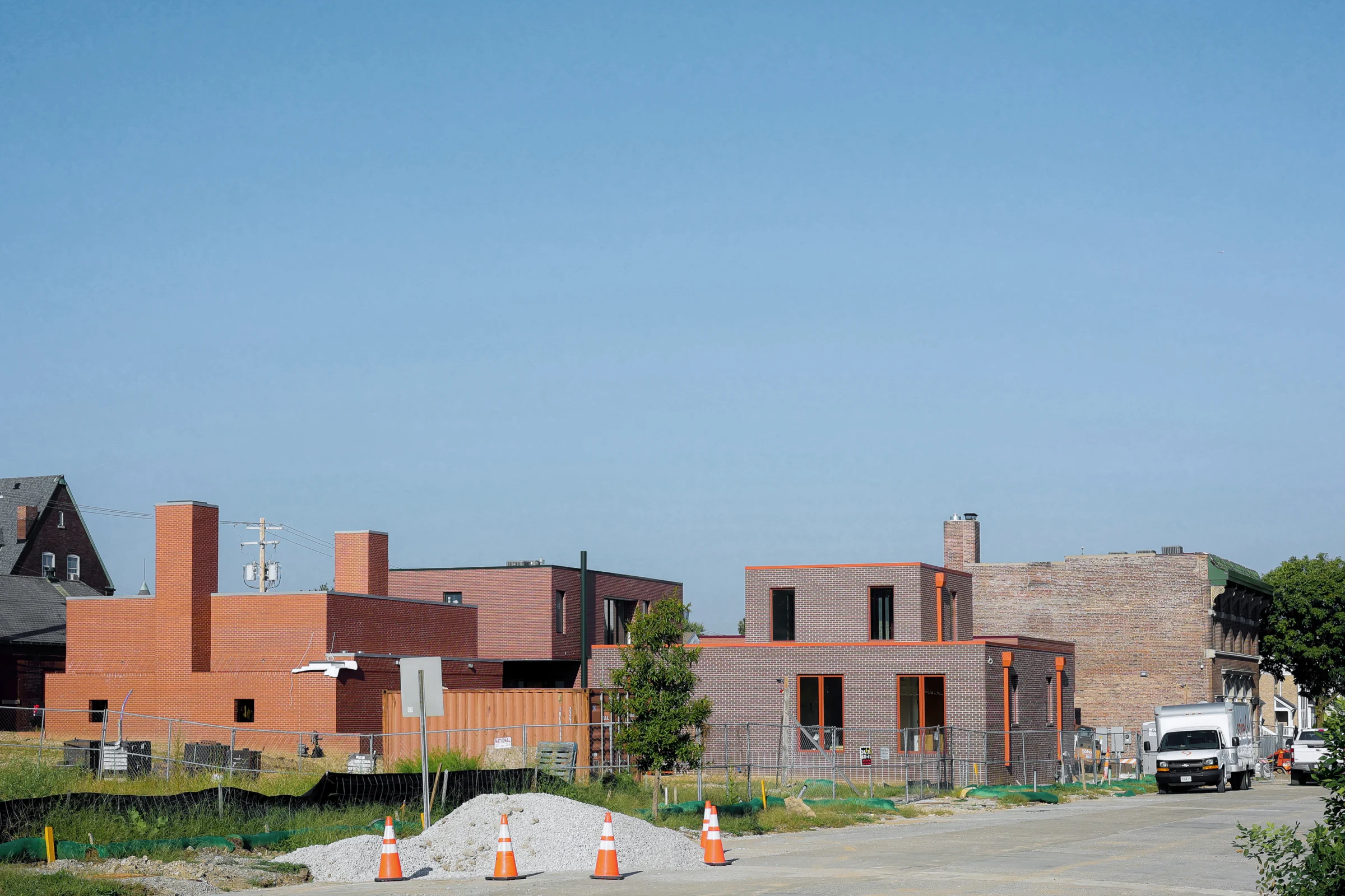
Volumes. Brick. Volumes of brick. Stacked blocks of brick. Heavy. Sometimes symmetrical. Other times slipped, off-center, askew. Movement. Proportions. Surfaces of bonds and joints define volumes. They make things less stable. Small and squat. On one side, to an open garden. On the other, to private walled gardens. A house within a garden. And gardens within a house. Originally we had another walled patio garden for the living room that they removed. Maybe for the better. All living spaces on 1 level. A place to age in place. Things repeat. Pairs. Doubling. 2 identical bedrooms. 2 bathrooms. 2 closets. 2 private gardens. 2 chimneys, also symmetrical. These are familiar. Contextual, even. Someone called them ears when they were taller. Now they are shorter. 1 chimney is full of fireplaces and flues. 1 empty. A void over a shower, lit from above. It feels larger on the inside.

Project Team: Michael Meredith, Hilary Sample, Paul Ruppert, Matthew Acer, Charles Dorrance-King, Lafina Eptaminitaki, Claire Logoz

  1. 1
  2. 2
  3. 3
  4. 4
  5. 5
  6. 6
  7. 7
  8. 8
  9. 9
  1. 10
  2. 11
  3. 12
  4. 13
  5. 14
  6. 15
  7. 16
  8. 17
  9. 18
  10. 19
  11. 20
  12. 21
  13. 22
  14. 23
  15. 24
  16. 25
  17. 26
  18. 27
  19. 28
  20. 29
  21. 30
  22. 31
  23. 32
  24. 33
  25. 34
  26. 35
  27. 36
  28. 37
  29. 38
  30. 39
  31. 40
  32. 41
  33. 42
  34. 43
  1. 44
  2. 45
  3. 46
  4. 47
  5. 48
  6. 49
  7. 50

Laboratorio de Vivienda

Book, 200 pages. New York: Artist book, 2019; 2nd ed., Barcelona: ACTAR, 2023. Including Giovanna Borasi, “A Large Urban Garden Where You Can Learn About Architecture.” 19" x 22" (original), 12.75" x 9.5" (second edition).

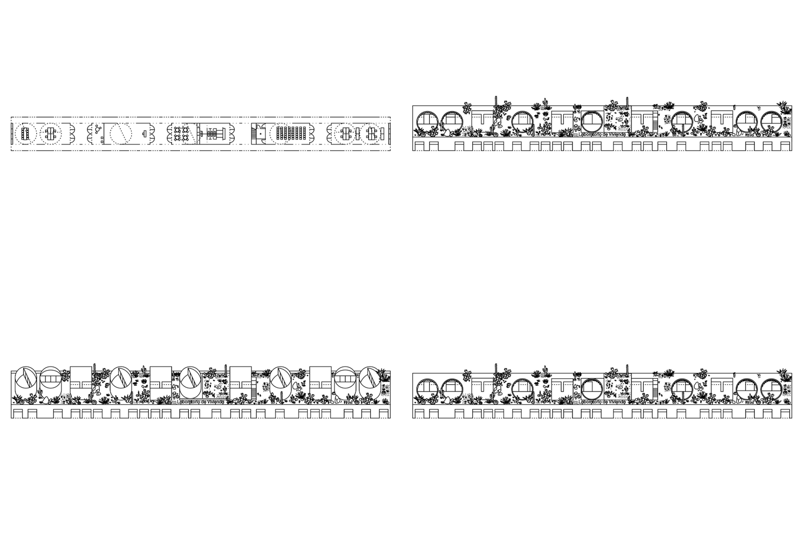
The 32 projects selected exhibit an architecture of primary (architectural) elements, straightforward geometries and proportions. Each proposal exhibits potential for growth by aggregation, simple repetition, or various strategies of extension, infill, and addition. It was important to consider how these proposals, assembled into a collective, would work together toward creating not an estate but a community for Apan.

The selection process revealed various categories and themes for which the projects could be classified. Some projects rethink the fundamentals of low-income housing’s spatial organization (corridors, courtyards, roofs), some rework labor and construction, and some recast structure or material. The forms of these works are generally economical but, unlike early-modernist projects at the Weissenhof Estate, their attitude is not one of a radical break. Today’s public will not protest flat (or pitched) roofs, and today’s architects will not claim to usher in a new style. If anything, these works relate to the vast, varied world of vernacular construction – to the majority of the built world that Architecture glosses over. Specifically, each house here responds to one of Mexico’s nine climatic conditions. At first glance, many of these works may not appear radically different from existing low-income housing. But upon closer study, the ingenuity of the selected projects becomes apparent as they become part of a larger whole and retain their individual identities.

The problem of low-income housing demands the thoughtful attention and expertise of architects like those included here. For, given the limited resources of such works, each decision gains greater significance and has greater impact on the design and on the life of its inhabitants.

Project team: Michael Meredith, Hilary Sample, Paul Ruppert, Cyrus Dochow, Fancheng Fei, Michael Abel, Mark Acciari, Lafina Eptaminitaki, Mark Kamish, Ben Dooley

  1. 1
  1. 2
  2. 3
  3. 4
  4. 5
  5. 6

House No. 14, A Room, Chimney, Cistern, and Roof

Location varies, 2018

A house. A room. A chimney. A cistern. A roof. Made of weathered steel, rust colored like the clay ground and everything else around it. 3 windows, 1 door, 2 skylights, 1 chimney, and 1 fire pit. An assembly of parts. The outdoor firepit is covered by an extra-large folded circle that doubles as a roof. The roof rests adjacent to the house, touching down lightly. Slightly askew, allowing water to drain. We’re told the 2 holes in the roof look like eyes. Especially at night, when illuminated by a fire. There is only 300 square feet of interior space. It was cheap, but not cheap enough. It was rejected. Eventually, we proposed it as a pop-up café. That was rejected, too.

Project Team: Michael Meredith, Hilary Sample, Lafina Eptaminitaki, Claire Logoz, Paul Ruppert

  1. 1
  2. 2
  3. 3
  4. 4
  5. 5
  6. 6
  7. 7
  8. 8
  9. 9
  10. 10
  11. 11
  12. 12
  13. 13
  14. 14
  15. 15
  16. 16
  17. 17
  18. 18
  19. 19
  20. 20
  21. 21
  22. 22
  23. 23
  24. 24

Housing No. 14, Athletic Track No. 1

Olympic Park, Oaxaca, Mexico, 2020

An athletic track. A series of tracks. A series of lines. Things placed in tracks, in lines, along lines. Slow lines. Fast Lines. Walking. Running. Some lines are closed loops. Some lines extend. Some are segments. All are in a park. Some are walls. Some are walking paths. Some are hallways. Some are buildings. Some are a new running track slightly larger than the existing track that was there previously. Olympic standards. A cafe and bar on the top of a line punctuated with two exclamation marks. ..!..!.. Offices. A place to sit and talk. Bleachers. Storage. Locker Rooms. Linked together by lines. The athletes move along their own lines. The audience starts along the same line as the athletes but quickly diverges, and moves in parallel. The lines form vectors of movement, paths and perimeters. Various volumes, tall squarish volumes, punctuate the lines, a necklace, a charm bracelet, a series of small towers moving along the perimeter running their own race, repetition, movement, rhythm.

Housing is only a short walk away. Located along a different track. It is something else. A different performance. A place for the athletes and guests. A series of parallel paths. Lines. Structural spans. Short cuts. Pedestrian streets. Lines punctuated by stair cores. Interrupted Lines. A mat building made of a series of rooms. Cellular. Individual Bedrooms and Bathrooms. Shifting. Shared laundry. Shared kitchens. Shared dining. Shared gardens. Always a little bit off. Random. Disjointed. Moving along the lines. Little parks. A courtyard. A meeting spot. Another courtyard. It fills the site like a carbonated liquid. Bubbles. It’s its own world. A collective communal world. More open than it seems. More connected than usual, with spaces to be alone.

Project Team: Michael Meredith, Hilary Sample, Lafina Eptaminitaki, Paul Ruppert, Yam Chumpolphaisal

Part of Larger Master Plan with Studio ZV

  1. 1
  2. 2
  3. 3
  4. 4
  5. 5
  6. 6
  7. 7
  8. 8
  9. 9
  10. 10
  11. 11
  12. 12
  13. 13
  14. 14
  15. 15
  16. 16
  17. 17
  18. 18

“Readymades Belong to Everyone”

New York, New York, 2018

Swiss Institute, New York, New York, June 23–August 19, 2018
Curators: Fredi Fischli, Niels Olsen

  1. 1
  2. 2
  1. 3

Exhibition Design No. 7, A Table To Put Things On

New York, New York, 2018

Project Team: Michael Meredith, Hilary Sample, Lafina Eptaminitaki, Paul Ruppert

Center for Architecture, New York, New York, April 12–July 7, 2018

  1. 1
  2. 2
  3. 3
  4. 4
  5. 5
  6. 6
  7. 7
  8. 8
  9. 9
  10. 10
  11. 11
  12. 12
  13. 13

A Book of 44 Low Resolution Houses

Book, 152 pages. Princeton: Princeton School of Architecture. 9.25” x 13”

This book contains 44 houses by 44 architecture offices:

6a, Adamo-Faiden, Angela Deuber Architect, Atelier Barda, Atelier Bow-Wow, Besler & Sons, Brandlhuber+, Bruther, Bureau Spectacular, architecten de vylder vinck taillieu in collaboration with Joris Van Huychem, Edition Office, Ensamble Studio, Fake Industries Architectural Agonism in collaboration with Aixopluc, fala atelier, First Office, GAFPA in collaboration with Stabico Ingenieurs, OFFICE Kersten Geers David Van Severen, Go Hasegawa and Associates, Hans Tursack, HHF and Ai Weiwei, Independent Architecture, Johannes Norlander Arkitektur, Johnston Marklee, The LADG, Lütjens Padmanabhan Architekten, MAIO, Monadnock, MPdL Studio, MOS, New Affiliates, OFF-OFF, Outpost Office, PARA Project, Pascal Flammer, Paul Preissner Architects, Pezo von Ellrichshausen, Point Supreme, PRODUCTORA, Stan Allen Architect, Tatiana Bilbao Estudio, Tato Architects, T+E+A+M, Tham & Videgård Arkitekter, and WORKac.

Project Team: Michael Meredith, Hilary Sample, Paul Ruppert
Graphic Design: Studio Lin

  1. 1
  1. 2
  2. 3
  3. 4
  4. 5
  5. 6

Exhibition Design No. 6, 44 Low-resolution Houses

Princeton, New Jersey, 2018

The house has an exhaustive history in architecture. It has been a protagonist of formalism through modernism and postmodernism. It has been a recurring problem for urbanism. Simultaneously, it has been considered a solution for urbanism and a problem for formalism (think: Levittown). The house has been at the center of phenomenological questions (dwelling), a frequent site of the everyday vernacular, and the primary subject of the digital/virtual (complex, animate, and dematerialized). But for this particular exhibition, houses were chosen simply because there are a lot of them circulating on the internet, available to gather. As such, the house has seemingly become more and more of a desirable design object, an image, a stage set, a thing, a product in how it is both made and culturally understood. The house reflects not just who we are but, increasingly, who we desire to be and how we project our identity. The house has become a receptacle for identity and technology, similar to our phones.

“44 Low-Resolution Houses” thinks about houses through a double technological and representational-aesthetic lens. All 44 houses fall into one or more of the following categories of low-resolution: first, houses that vaguely resemble houses, using familiar house elements like pitched roofs, chimneys, windows, doors, porches, etcetera; second, houses that appear to be constructed, in that one can see the construction, joints, and materials, and have a sort of cheap, unfinished quality; and third, houses that are composed of basic geometric primitives – squares, circles, triangles – arranged (primarily planimetrically) in a noncompositional or abstract manner. By these terms, low-resolution is against high-resolution architectural sophistication, gestural complex curvature, bodily organic figuration, and architectural paradigms focused on seamlessness and integrated smoothness.

This polemic, framed through resolution, suggests that high-resolution architecture operates as a form of distraction, a special effect, while low-resolution architecture engenders attention by being slightly off, crude, or abject. The loss of resolution directs us to think about architecture’s construction, its techniques, references, typologies, and materiality, while high-resolution glosses over the architectural object. Low-resolution includes glitches, gaps, the handmade, and abstraction, while high-resolution is an expression of complex technological expertise, where the ultimate desire of technology is to disappear into its environment. Low-resolution forces us to pay attention, to focus, to construct a reading of the architecture. As technology moves toward a seemingly unmediated, individualized expressionism, a world of constant distraction, “44 Houses” suggests a counterpoint: the (renewed) need to slow down, to study, to compare… to take apart architecture and look for specificities, to construct narratives, to perform analysis, to be attentive to our attention… and to take pleasure in the work of reading, of making comparisons, of constructing architectural values, rather than simply seeing, desiring, using, or being amused and distracted.

Each house is given a number and removed from its context, treated like an untethered object or image. All 44 houses are re-represented in the same medium (CAD lines plotted on 100-pound white Bristol paper), at the same scale (1/4”=1’0”), which allows comparison of the houses without comparing representations.

Some obvious curatorial decisions were made regarding the exhibition and this catalog. Each house is given a number – from 1 (6a) to 44 (WORKac) – and is removed from its context, which is arguably a source of debate. For better or worse, each house is treated like an untethered object or image, which is how we mostly experience architecture anyway. (Architecture is only produced through its circulation.) All 44 projects are re-represented in the same medium (CAD lines plotted on 100-pound, white Bristol paper), at the same scales (1/4”=1’0” [models] and 1/16”=1’0” [plans]) and with the same orientation (north). This was done so that we might compare houses without comparing representations. Additionally, each architecture office was asked to provide a material sample, product, or building element to represent its house at full scale. The exhibition oscillates between model as image (the primary view of the exhibition through the exterior window, the photo-studio environment and lighting), image as model (CAD working drawings printed on paper then folded into models), and model as model (material samples and building products). It was staged as if everything was floating, on display.

Project Team: Michael Meredith, Hilary Sample, Paul Ruppert
Graphic Design: Studio Lin
Photography: Michael Vahrenwald

North Gallery, Princeton University School of Architecture, Princeton, New Jersey, September 11–November 9, 2018

  1. 1
  1. 2
  2. 3
  3. 4
  4. 5
  5. 6
  6. 7
  7. 8
  8. 9
  9. 10
  10. 11
  11. 12
  12. 13
  13. 14

House No. 13, Parts Collected

Los Angeles, California, 2018

An idea. A house made of blocks. Triangles, rectangles, half-circles, squares. Blank looks. A child’s toy. No square windows. Square skylights. Glazing. Interior-oriented. Privacy is important. Small exterior spaces throughout the inside. A connection to nature, sky, air, light, vegetation. This is a proposal for an economically viable scheme for additional rental housing. Accessory Dwellings in LA. Dense Backyards. Endless Variations for different sites. Rhythmic Progression. Everything is prefabricated. Stacked and assembled on site with a small crane. It is easily built and easily constructed. It’s like modular concrete drain pipes. Everything fits on a flatbed trailer. Everything can be assembled quickly. It is systematic. Wall. Vault. Sawtooth. Chimney. It repeats, but not always be the same. It can adapt. It can grow or shrink or be reused.

Project Team: Michael Meredith, Hilary Sample, Paul Ruppert, Michael Abel, Stefan Klecheski, Lafina Eptaminitaki

  1. 1
  2. 2
  3. 3
  4. 4
  5. 5
  6. 6
  7. 7
  8. 8
  9. 9
  10. 10
  11. 11
  12. 12
  13. 13
  1. 14
  2. 15
  3. 16
  4. 17
  5. 18
  6. 19
  7. 20
  8. 21
  9. 22
  10. 23
  11. 24
  12. 25
  13. 26
  14. 27
  15. 28
  16. 29
  17. 30
  18. 31
  19. 32
  20. 33
  21. 34
  22. 35
  23. 36
  24. 37
  25. 38
  26. 39
  27. 40
  28. 41
  1. 42
  2. 43
  3. 44
  4. 45
  5. 46
  6. 47